Revamping current system
The Metropolitan Museum of Art is a renowned museum of worldwide cultural exhibits. My partner and I found that the existing icon system of the MET was inconstant to their brand due to the irregular line quality and inconsistency of the icon complexity regarding the scale and shapes of the subject figures. The icons lacked a familiar system to tie them all together as one symbol set. Our objective for this project was to redesign an icon system that would improve the visual communication of legibility and representation of the museum branding.
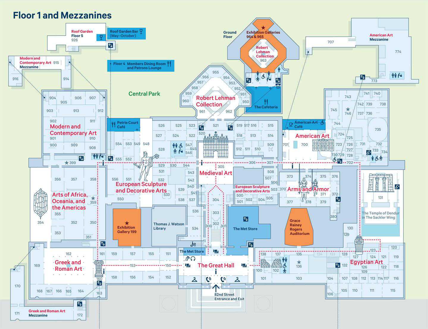
Current icon system on the MET's exhibit map
Drawing inspiration
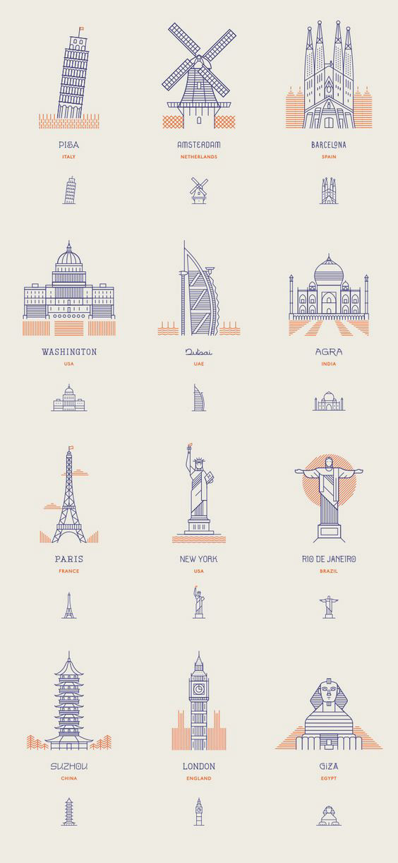
Taking our critique into account, we decided to revise the symbols by adding more linear lines to make them more visually complex and refined in detail. We drew inspiration from the Pentagram icons of NYC and other icons that combines linear lines and patterns as well. Experimenting with different orientations of the icons, we needed to figure out the balance between the contrast of linear details of the subject and the extra patterned decor we wanted to integrate.
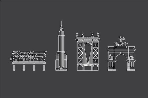
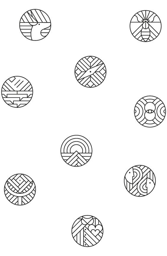
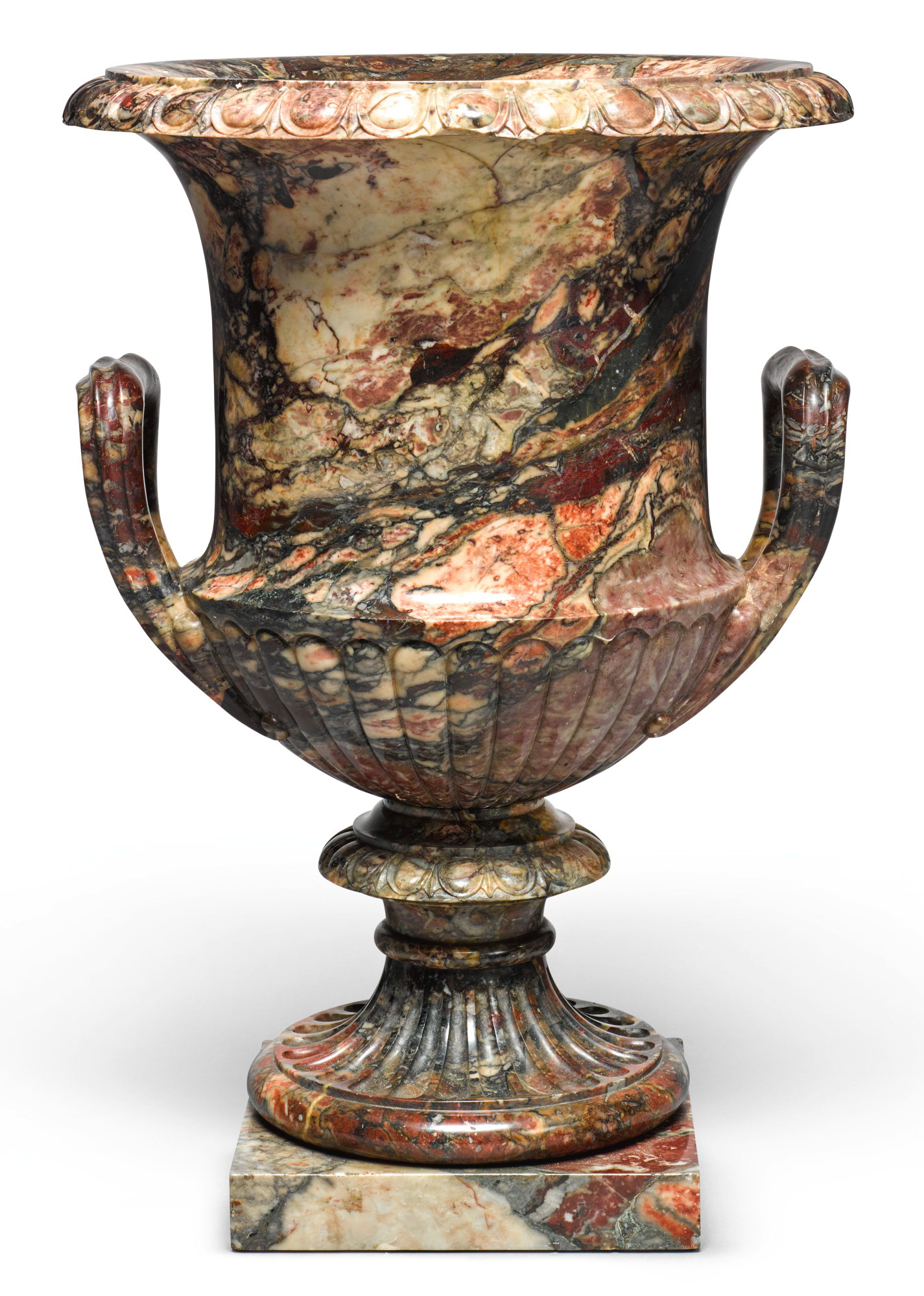
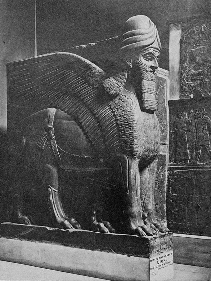
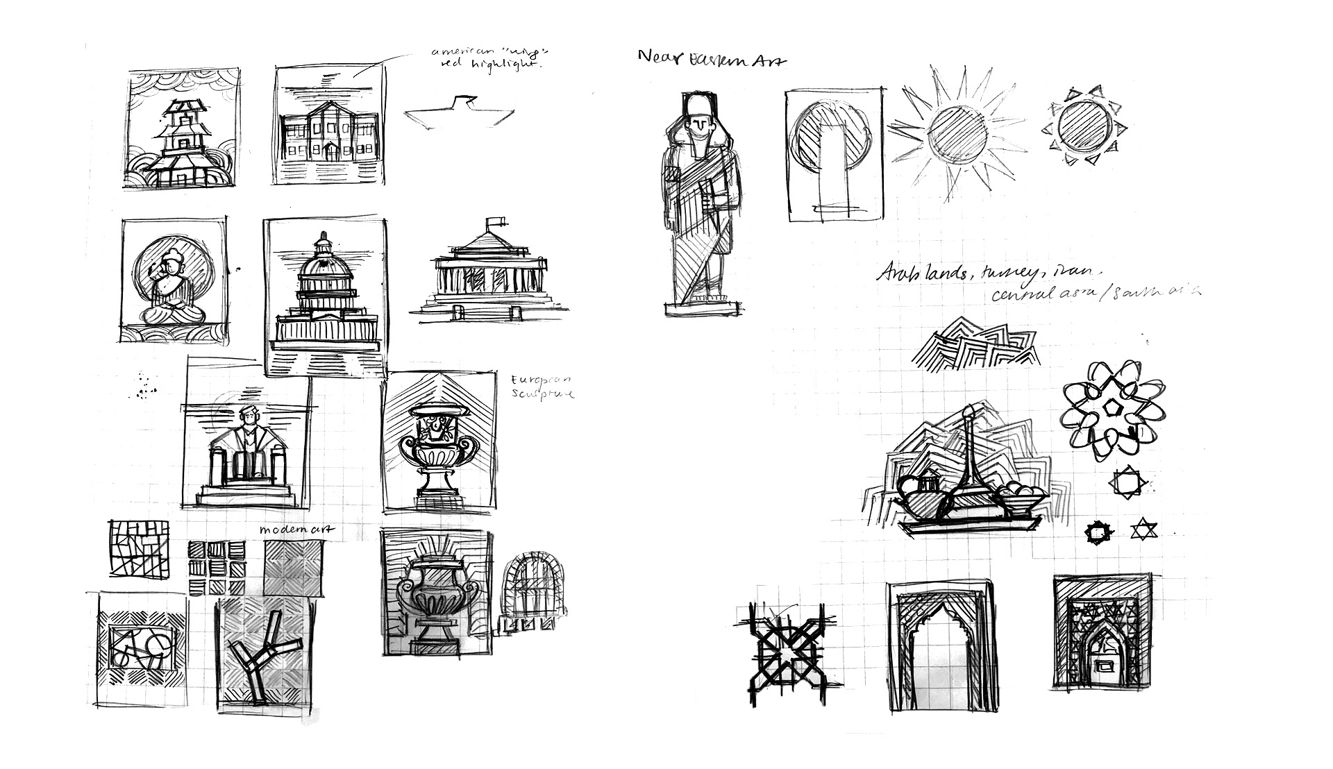
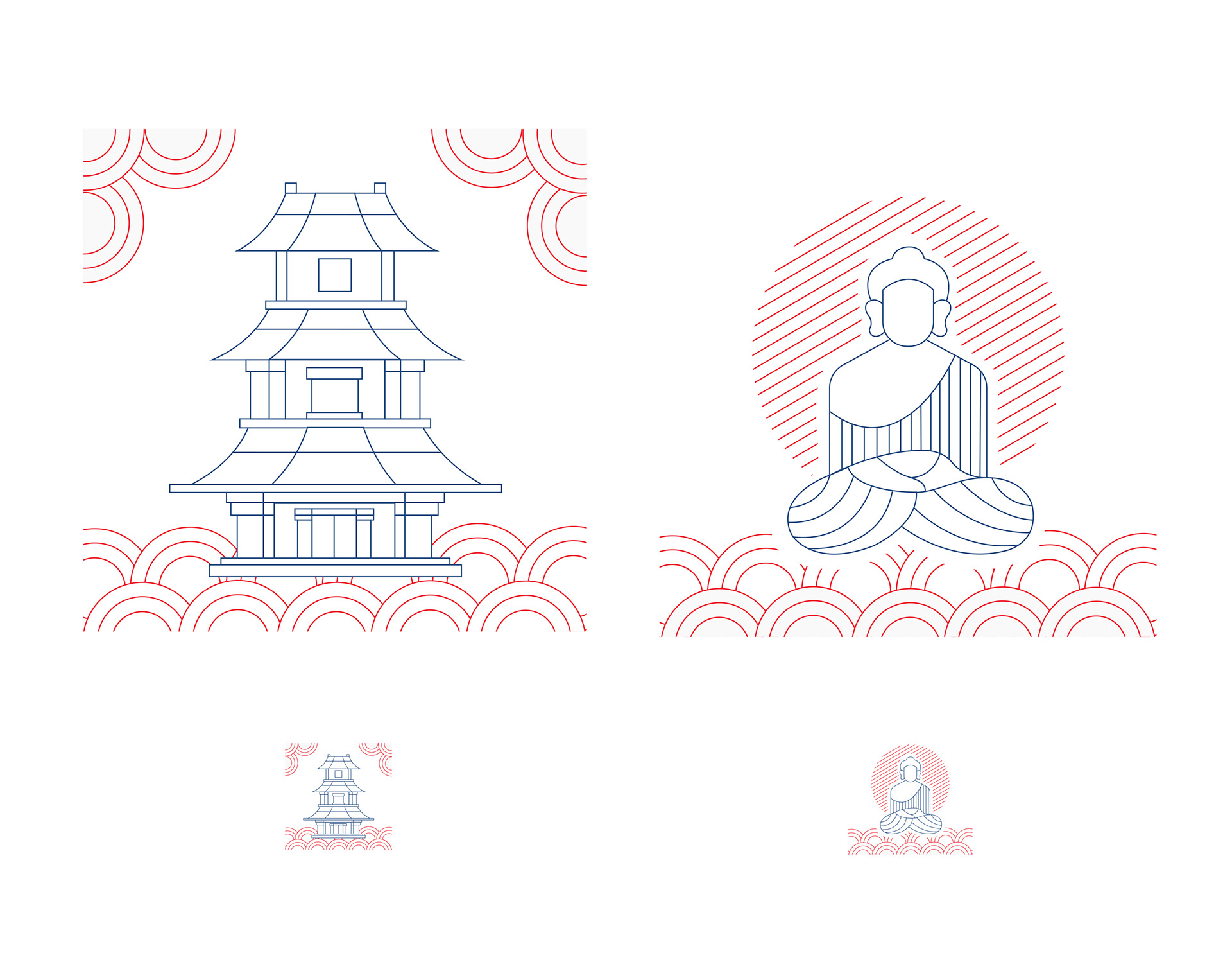
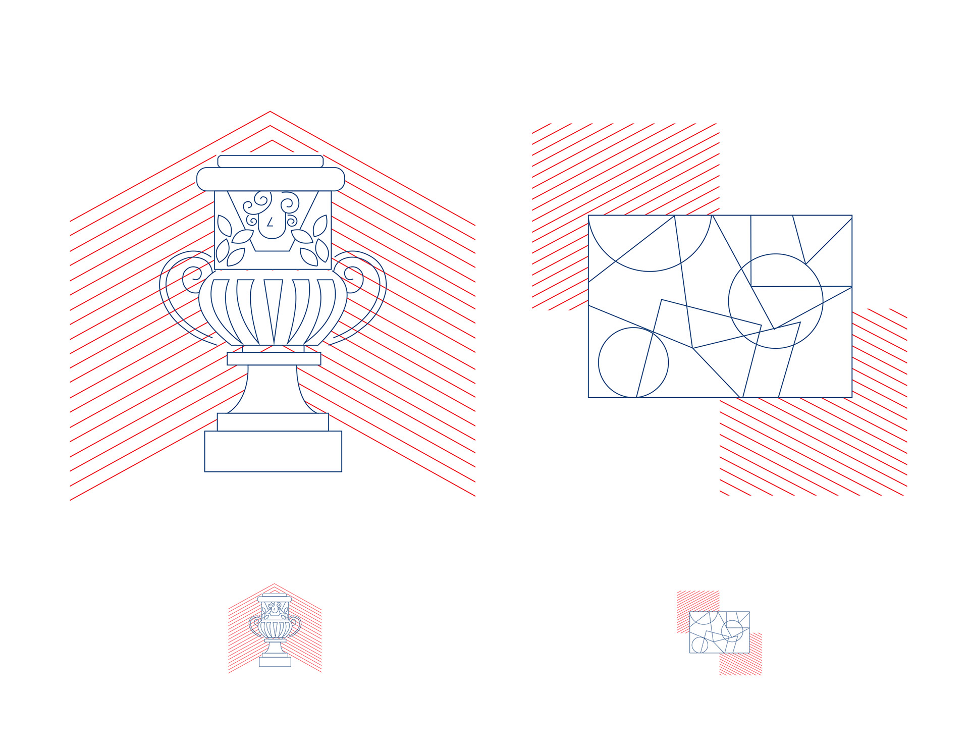
Artifact inspiration
Applying these inspiration styles to our design iteration, we also decided to reference key artifacts of the MET’s cultural exhibits in our illustrations to ensure an accurate representation of the museum sectors. Our research consisted of reading the museum guides of each department and finding the main themes and motifs of featured artifacts to include in our symbol set. The patterned decor quality added uniqueness to our icons and gave more visual context to the subjects.
Symbol Iteration
At the beginning of the ideation process, we were required to divide our design workload among a team of two with each person creating 6 symbols. We decided to outline key departments in the MET and focused our designs based on the different cultures that the museum includes in its exhibits. Our initial icon iterations showcased noticeable segregation of styles between the sketches my partner and I each drew for our 6 symbols. The symbol sketches altogether showed a common language in the simplicity of lines and minimalistic imagery of the subjects, some encasing circular shapes.
Moving forward, our challenge was to create a system for the symbols to appear consistent in branding between two designers and to revise the symbols so that it fits the existing style of the MET.
CRITIQUE INSIGHTS MOVING FORWARD
• Imagery is too simple and abstract
• Symbol illustration is too childish and bubbly in characteristic
• Complexity of lines may help with portraying the subject matter in a more realistic & sophisticated way
• Symbol illustration is too childish and bubbly in characteristic
• Complexity of lines may help with portraying the subject matter in a more realistic & sophisticated way
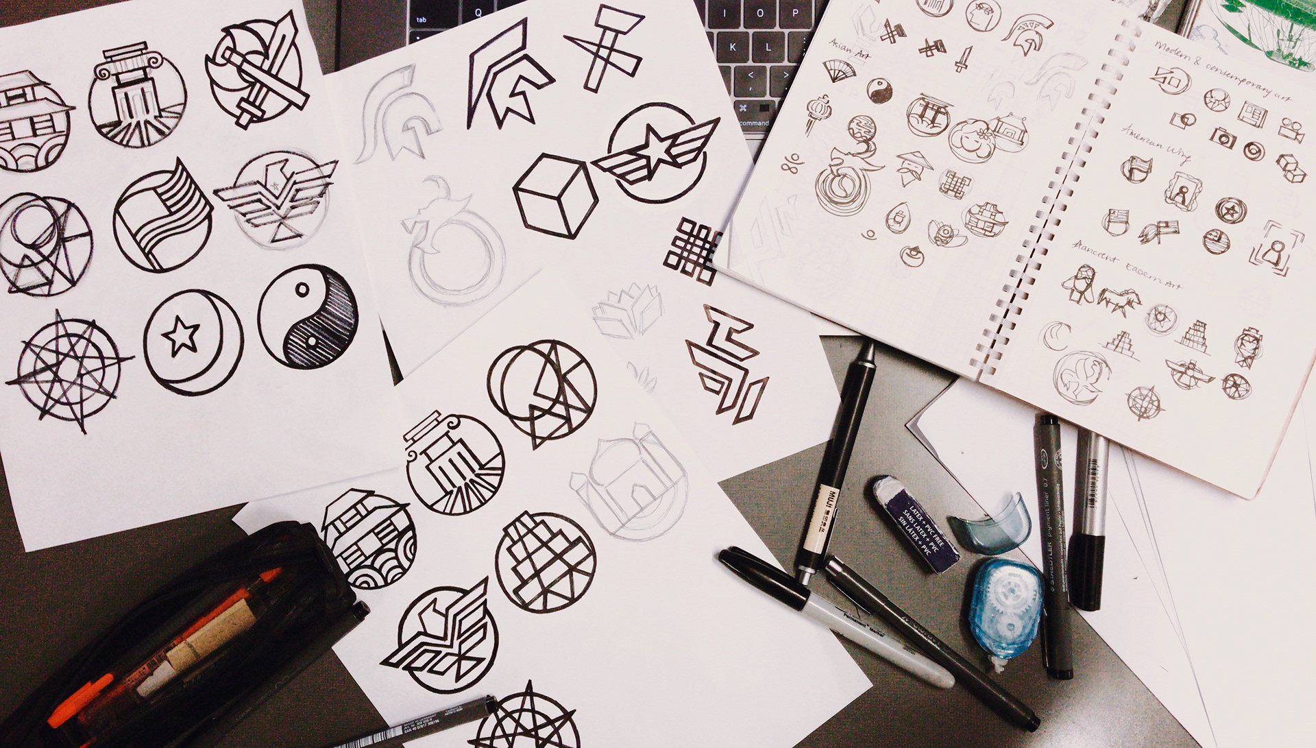

First round of symbols ideation
Digital transformation
Digital revisions were then implemented to test the style of the linear details of the symbols and their respective patterns per department.
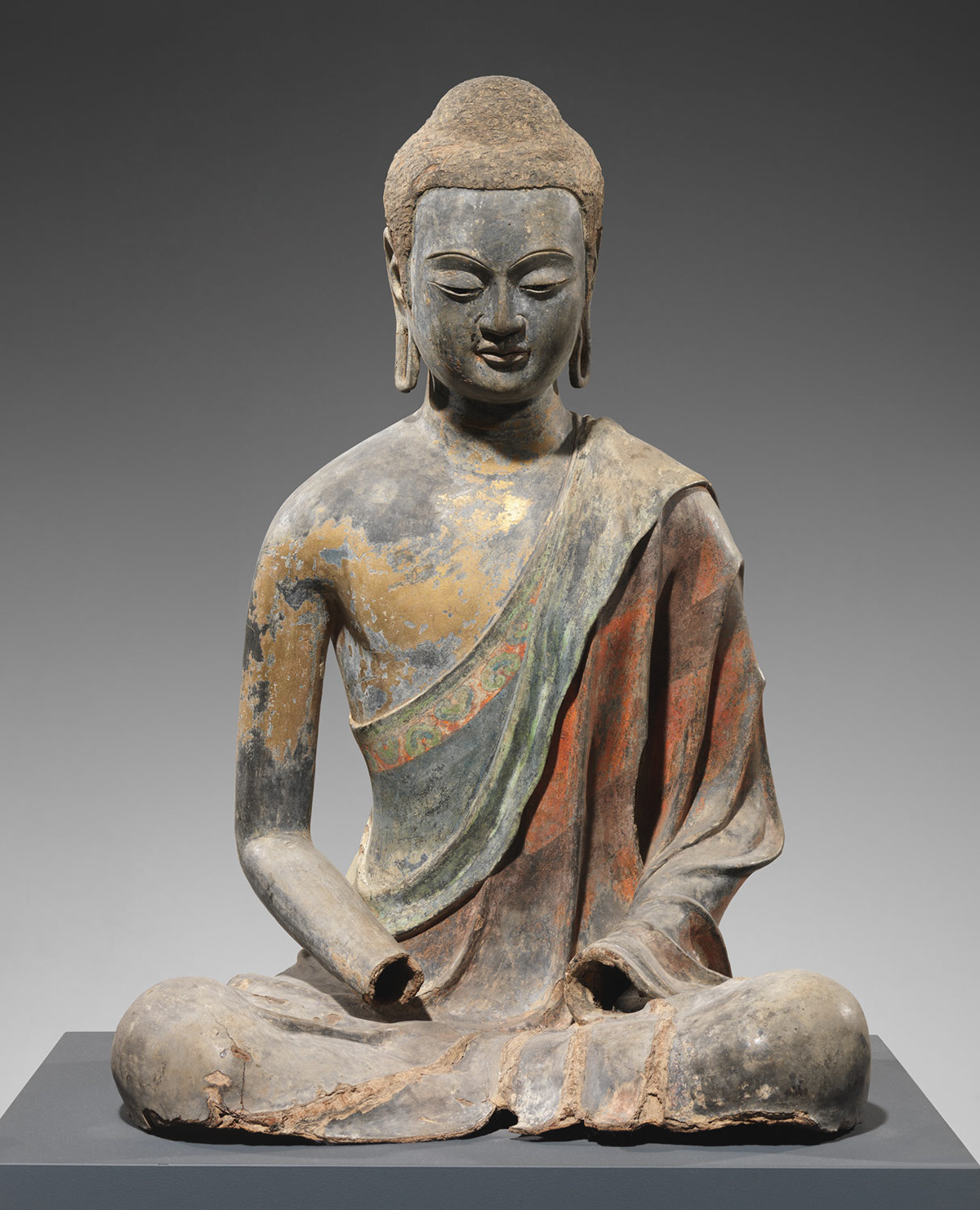
Notes that we took from this digital transformation are that we needed a more cohesive and systematic branding for the patterns and that the linear lines should be heavier in weight to make the icons not appear as faded in color and fragile in their linear quality in order to ensure legibility. In addition, the icons should be balanced in their geometric quality by reducing organic parts of the icons, i.e. the buddha structure.

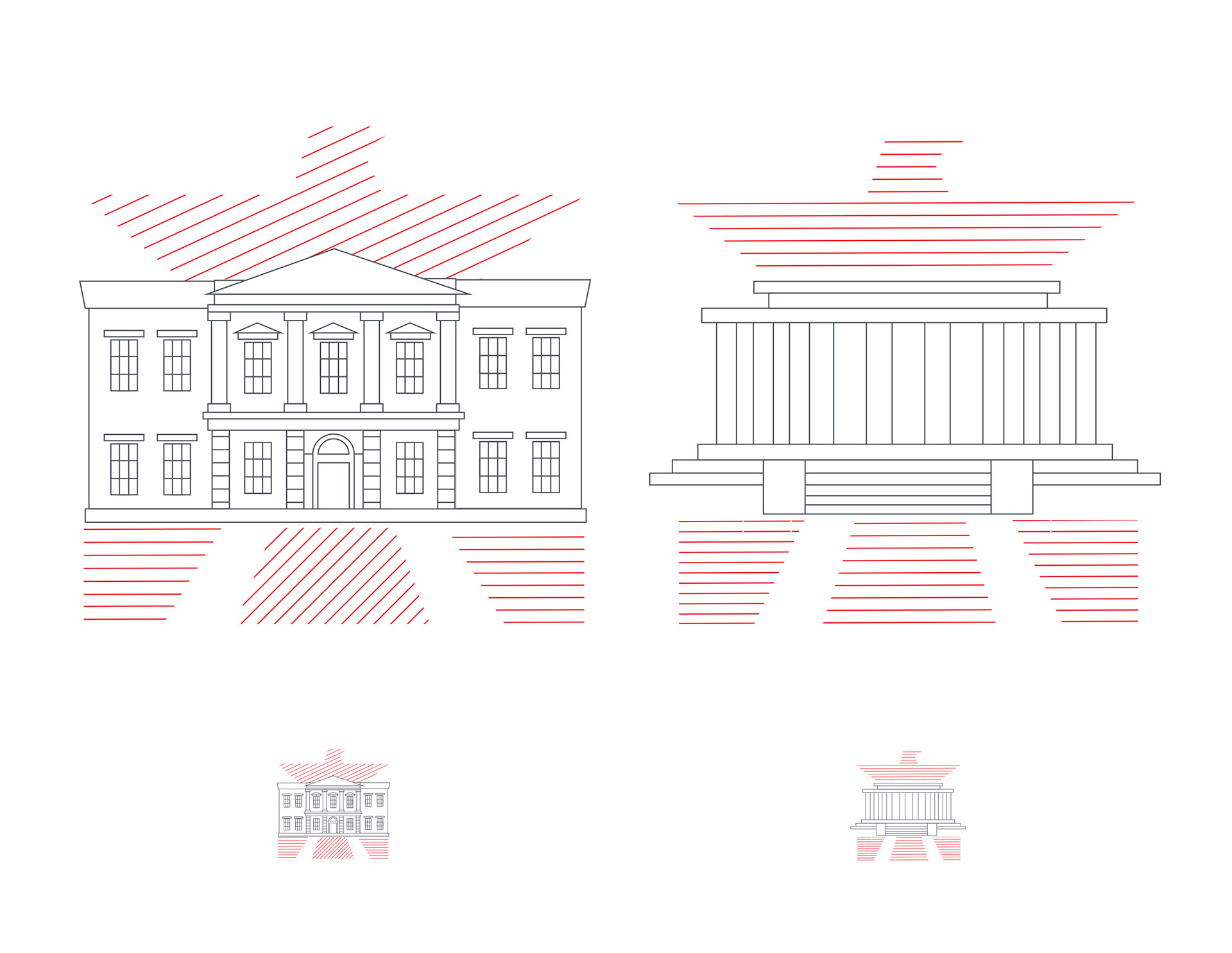
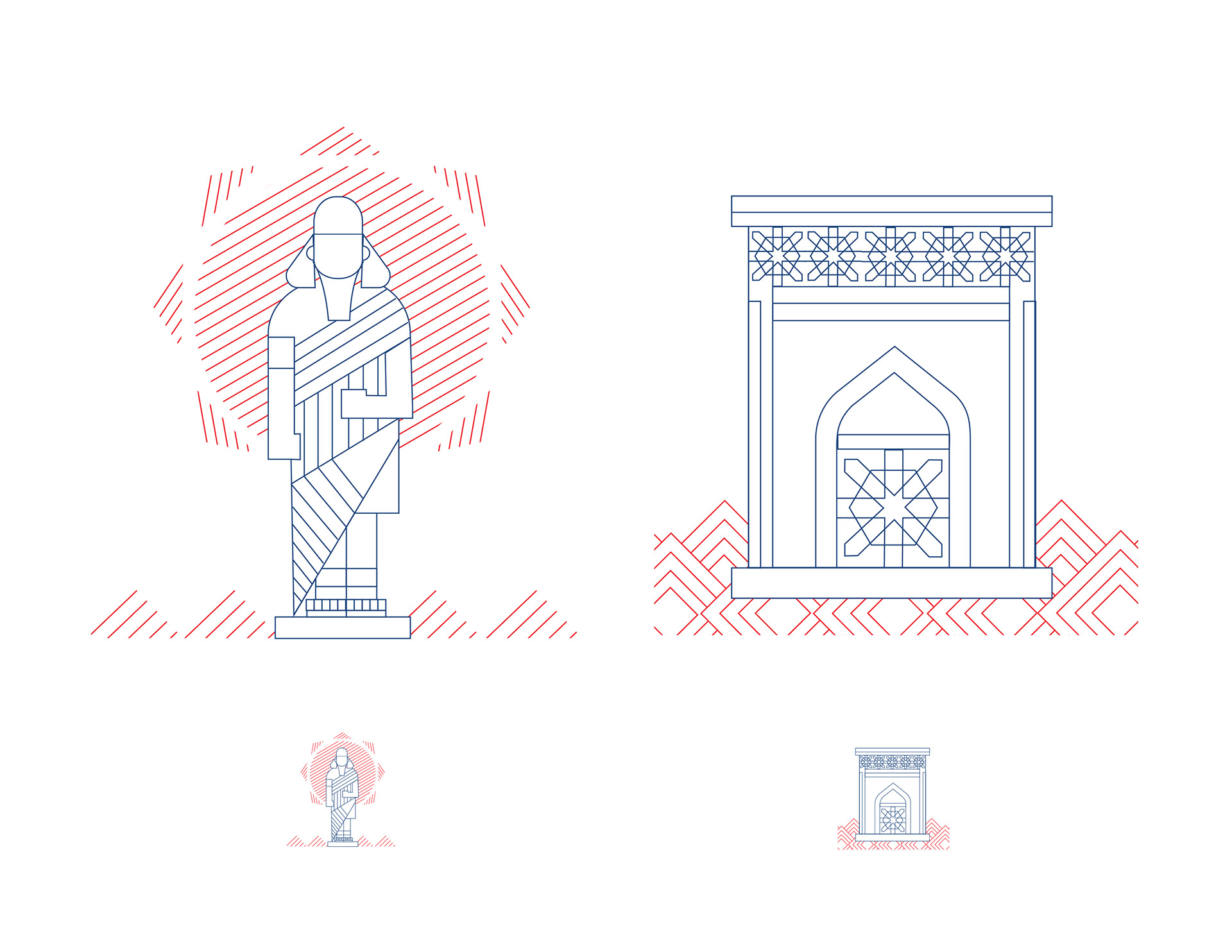
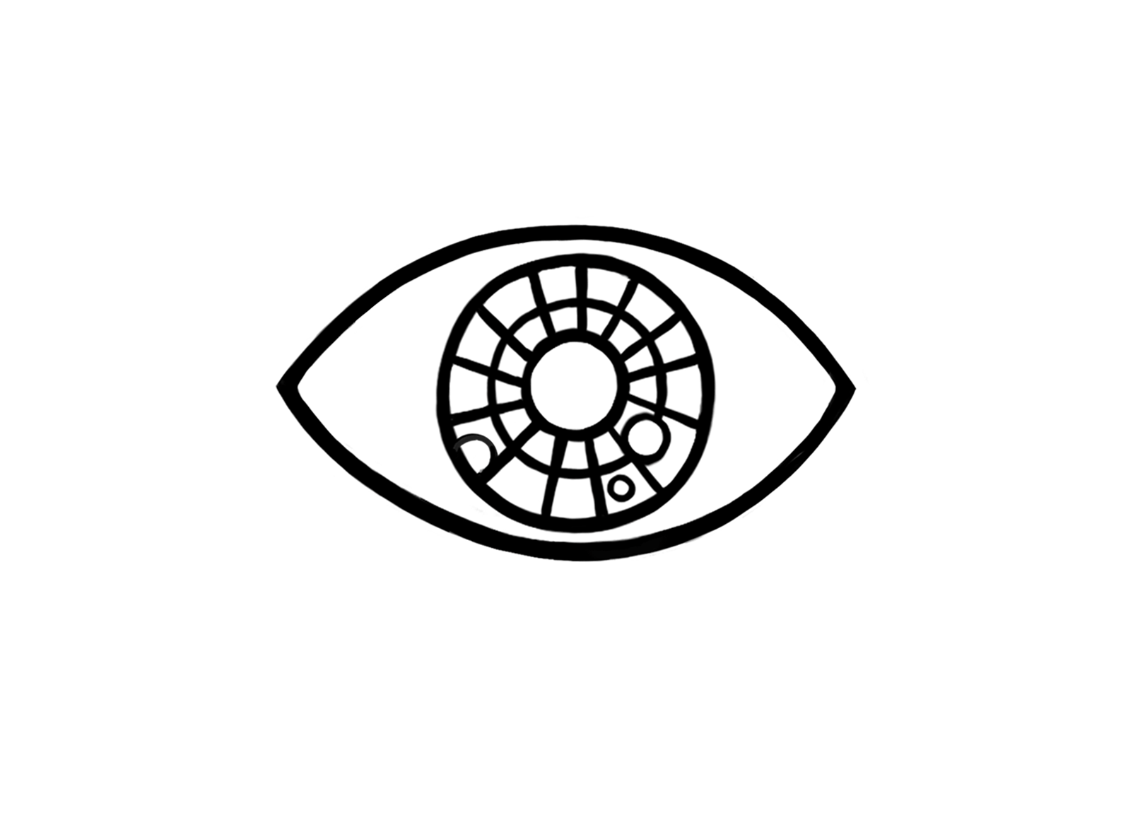
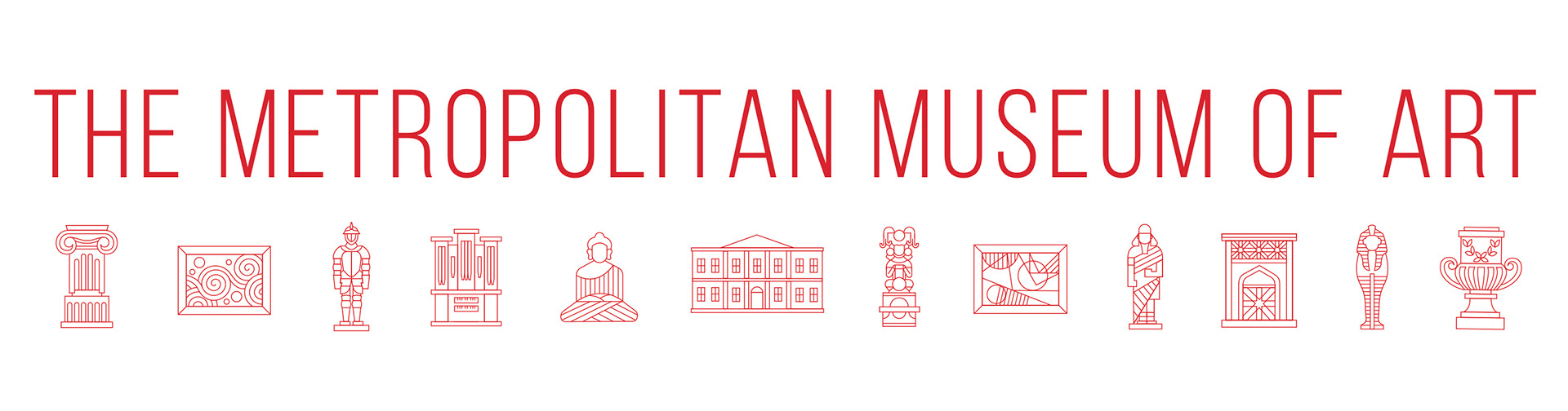
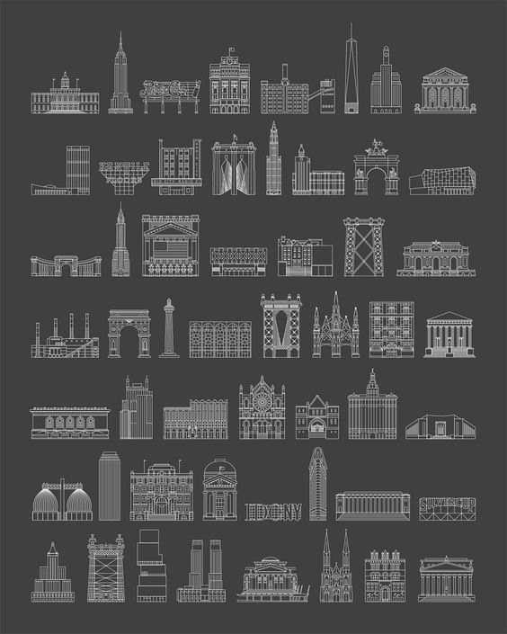
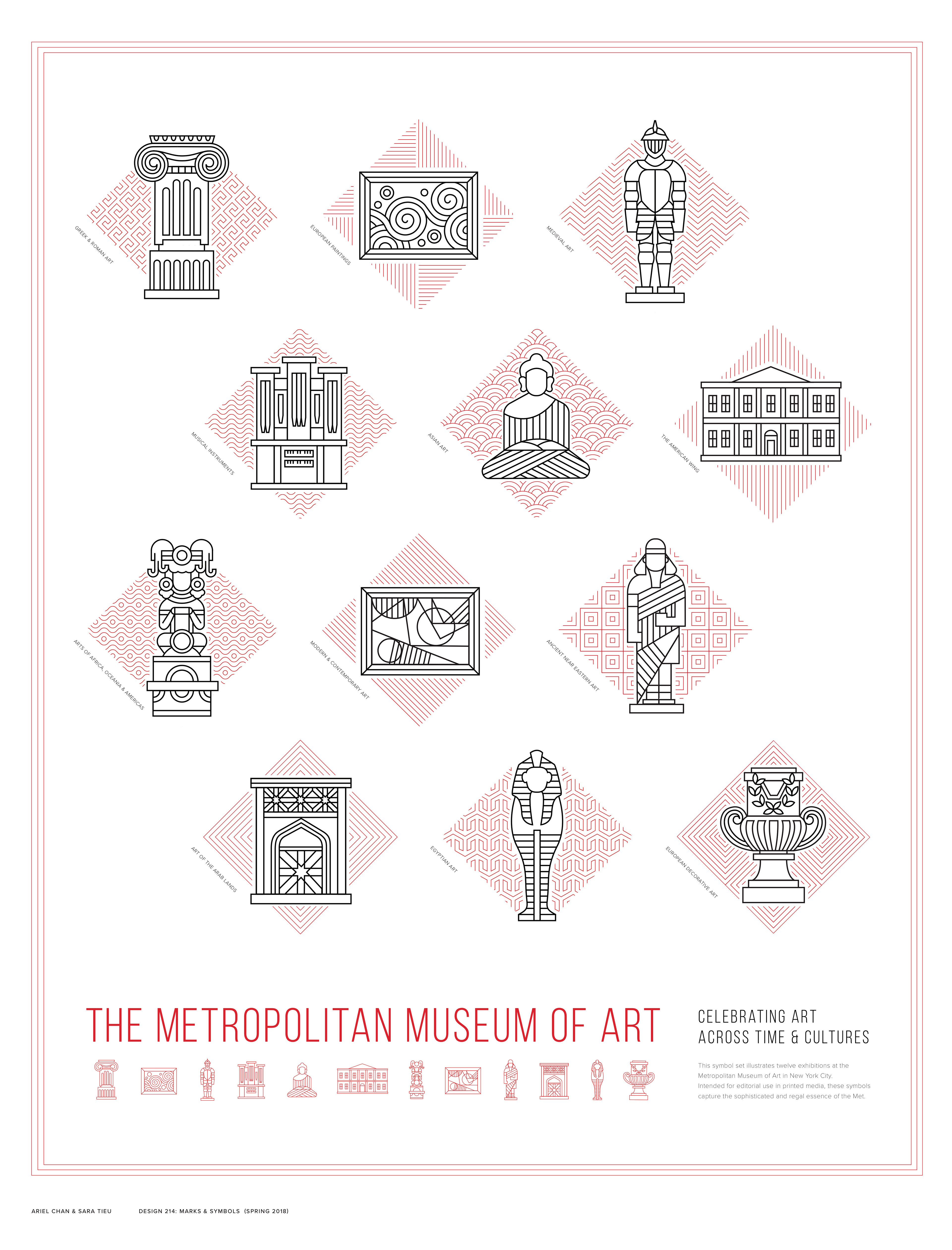
The final Metropolitan Museum Symbol set
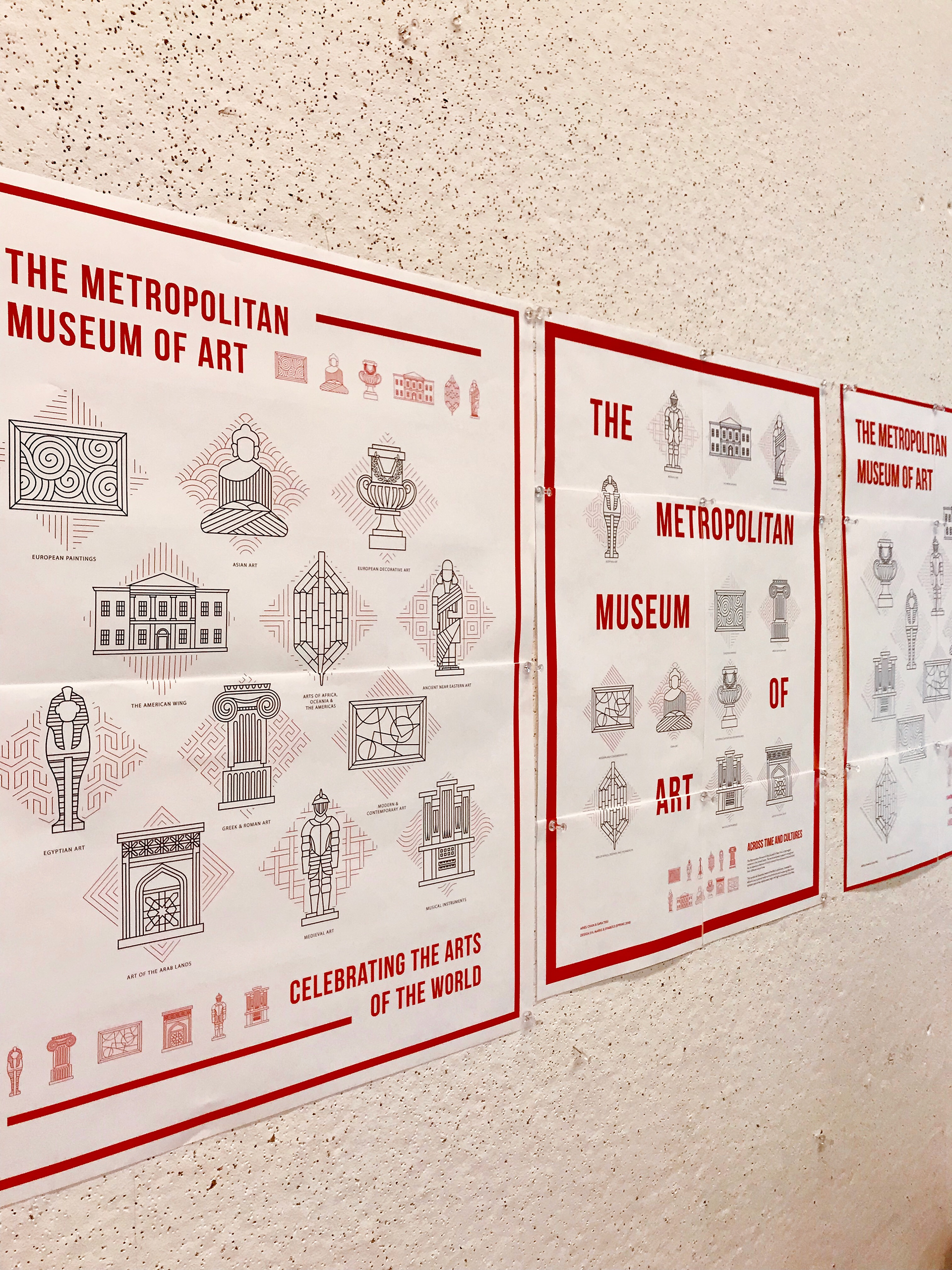
Our final symbol set features a refined linear style of the museum artifacts with added linear details and a diamond-shaped container that showcases a line pattern pertaining to the uniqueness of the cultural exhibit. We weighed in considerations such as making the lines of the patterns closer to each other so it looks more condensed and contrasted in color compared to the artifact subject, and distributing the lines so the spacing between each remains consistent.
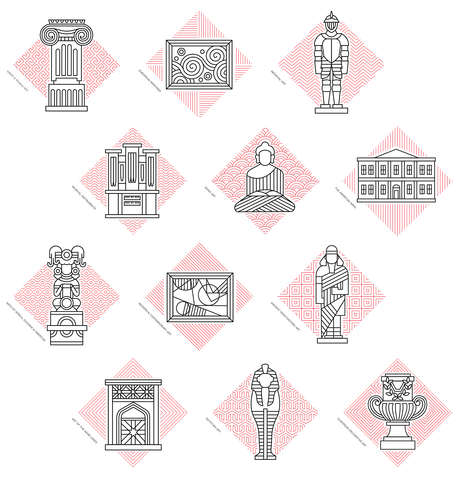
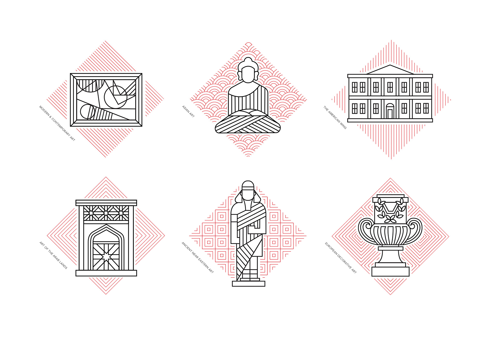
SYMBOLS I MADE
Twelve symbols were required to be created for a group of two — each person created 6 symbols.
I designed Modern & Contemporary Art, Asian Art, The American Wing, Art of The Arab Lands, Ancient Near Eastern Art, European Decorative Arts
I designed Modern & Contemporary Art, Asian Art, The American Wing, Art of The Arab Lands, Ancient Near Eastern Art, European Decorative Arts
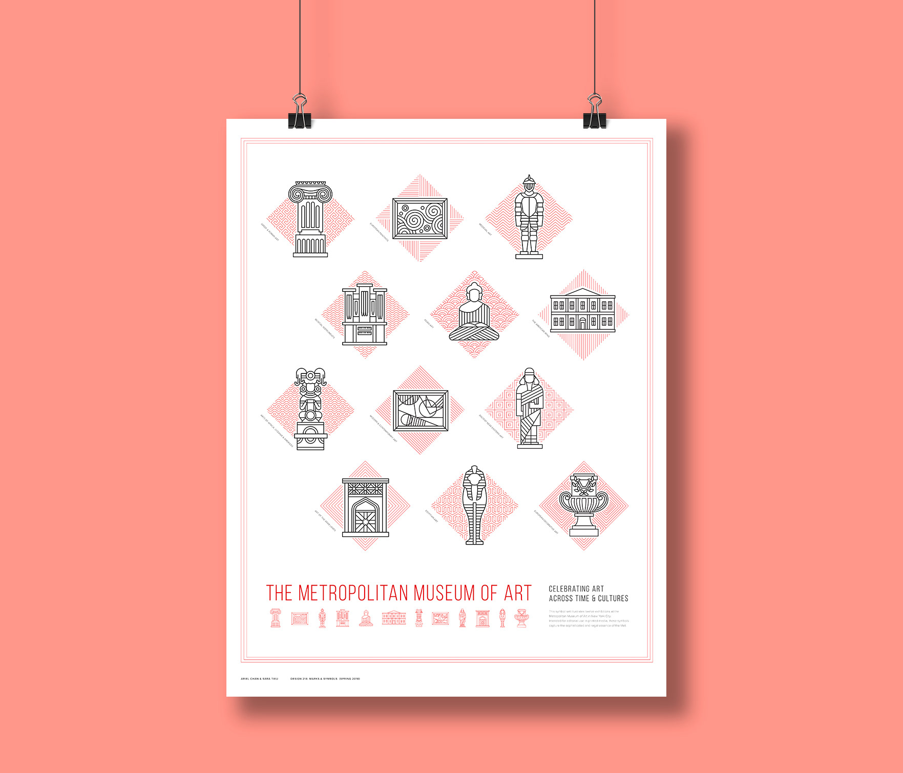
First initial directions of the poster design
POSTER ITERATION PROCESS
My partner and I faced the challenge of arranging the icons in a dynamic composition that does not overpower the central focus of the designed icons since the lines are thin and delicate. Iterations of poster designs were made in exploring compositions and selecting a clear visual direction.
Our objective was to design a poster composition that ties the visual branding system of the Metropolitan Museum of Art as a whole. With the decisions that we made to reduce the weight of the border, lines, and typeface, we were able to find a middle ground between creating a visually interesting poster and emphasizing the icon details.
PROJECT DETAILS
CONTEXT
Collaborative symbols project
16.5" x 21.5" poster
DESIGN 214: Marks & Symbols with Karen Cheng
16.5" x 21.5" poster
DESIGN 214: Marks & Symbols with Karen Cheng
TEAM
Sara Tieu (Ideation/Iteration, Symbols Editor & Poster Direction)
MY ROLE
Ideation/Iteration, Symbols & Poster Designer
DURATION
5 weeks
TOOLS
Sketching, Adobe Illustrator