The problem scope —
Materials used in exhibitions are some of the most unsustainable in the design world, like PVC (polyvinyl chloride) and other plastics.
Most installations and exhibitions are temporary and the materials used to create them are often sent straight to landfill as soon as it’s time for the next show or promotion. In recent years, more sustainable options and practices have started to become available, but the field is still a long way to go.
The Challenge
In this project, we were tasked to use waste as a topic for exploration, experimenting with materials and combining with visual communication to educate our audience.
Receipts — a waste of space.
After brainstorming the type of material we wanted to focus in our installation, my team and I decided to move forward with receipts: a commonly used piece of paper we handle everyday within our daily transactions. There were a huge amount of shocking statistics to be educated about receipts that we were not aware of in the beginning, which made it all the more intriguing to delve deeper into creating our installation.
We discovered information on the origins of receipt paper, the environmental effects of receipt waste disposal, and emerging solutions of sustainable alternatives.
*See the full research we conducted here.
ALARMING STATISTICS (Beat the Receipt Report)
The UK prints 11.2 billion receipts a year, with around 90% of the receipts being wasted, either being lost, too faded to use, or thrown away after being issued.
75% of receipts are thrown away unused.
Nearly half of the British population (47%) think that all paper receipts are a waste of paper.
KEY QUESTION
"Are receipts recyclable?"
The main question we wanted to pose to the public is to ask them if they think that receipts are recyclable or not. I even created an informal Instagram poll on social media to gauge the split vote between the two options. The purpose of this question is to allow the audience to think about their conscious decision of recycling receipts.
THE ANSWER
93% of receipts are not recyclable because they are coated with BPA/BPS.An alarming statistic we discovered within our initial research is that a majority of receipts are printed on thermal paper that contains Bisphenol A/S (BPA/BPS), an endocrine disruptor chemical that could cause hazardous health effects in our immune system. This indicates that only 7% of receipts are phenol-free and recyclable.
THE PROCESS
How might we educate others about the cause & effects of unsustainable receipts?
We ordered the research findings we conducted to form a cohesive linear narrative that could be easily communicated to our audience. First, we want to define what is BPA/BPS, why are they not recyclable, what kinds of harmful effects they cause, and then offer the best alternatives to receipts moving forward.
Brainstorming the form of our installation.
With a solid foundation of our receipt research, we continued to conceptualize the form and function to make our installation logical and seamless in interaction.
Three initial concepts
Concept 1: Voting Poll
Transforming the receipt into a voting poll campaign. Voters would receive an “I Voted” takeaway with a fun fact associated with the decision they made.
Example question:
Where do your receipts go?
A. Keep receipts for record
B. Digital receipt alternative
C. Immediately throw away receipts
A. Keep receipts for record
B. Digital receipt alternative
C. Immediately throw away receipts
Concept 2: BPA Forest
An interactive installation room made from receipts, featuring statistics of BPA-coated thermal paper or raising awareness of deforestation with receipts consuming over 3 million trees.
Concept 3: The Coated Transaction
Wrapping objects involved in a typical transaction setting with statistics pasted on to show how many receipts have been wasted. The goal is to inform the consumer when they are making the conscious decision to take an electronic receipt over a printed one at the end of the transaction.
Prototyping the model of our installation.
After receiving feedback from our critique, my team and I constructed a mini mock-up of our installation to visualize how might we leverage the poll question with the answer reveal. We sourced unused receipts from stores around University District (The Ave), friends and family, and from our own personal collection.
Combining the question and answer – revealing in one interaction with seamless simplicity.
A major consideration that surfaced within our deliberation process is to make the interaction accessible and seamless in our space. We wanted to simplify the experience and avoid the complexity of users having to initiate a second action in order to reveal the answer to the question, separating the space into two sections. We further sketched our idea on paper to visualize the form, dividing the space into two to instigate the separation between the poll, "yes" or "no".
INSIGHTS MOVING FORWARD —
1. Two separate interactions might hinder users to learn more about statistics.
Visualizing the distribution of poll with stakes would be an interesting imitation of receipt treatment. However, it is a separate interaction from the curtain revealed in the backdrop. A negative user experience we thought of is, for example, the user voting the poll at the front without entering the curtain to learn more about the information.
2. Making a flexible installation for multiple user interactions at once.
Finding a way to make the space interactive for multiple users would be important to consider the flexibility of the installation and avoid causing traffic by having users lining up to vote and read the information one at a time.
3. Curtain material exploration.
The curtain is a great motif to emphasize the number of receipts wasted and display the remains of grease and oil collected from the BPA/BPS material. Using a durable material to connect the receipts altogether would be essential to make the first impression of our installation.
Mock-up visualization of installation sketched on Procreate.
Reimagining the layout of our space.
After choosing to base the location of our installation inside our School of Design building, we began to think about the spatial arrangement of our components. Key considerations included content strategy, visualization of the statistic, and the narrative we wanted to guide our audience within the space.
Iterations of our installation layout and the arrangement of typography and content components.
Final layout of our installation.
Discussing these considerations, we finalized the diagram of our space with linear details to divide the space into two in order to visualize our key statistic. In addition, we used the secondary left wall to lay out information about the narrative of why BPA/BPS receipts are not recyclable. The narrative poster series are designed to mimic the form of receipts that is integral to our branded space.
Constructing the installation in the real space.
We first made measurements of the location to plan out where we would place the elements in relevance to width and height. The display walls are tiled with recyclable paper and black masking tape to add visual contrast and resemble the monospace typeface quality seen in cash registers. Duct tape is used to manually install the individual letterforms on the ground and the diagonal pattern for durability purposes.
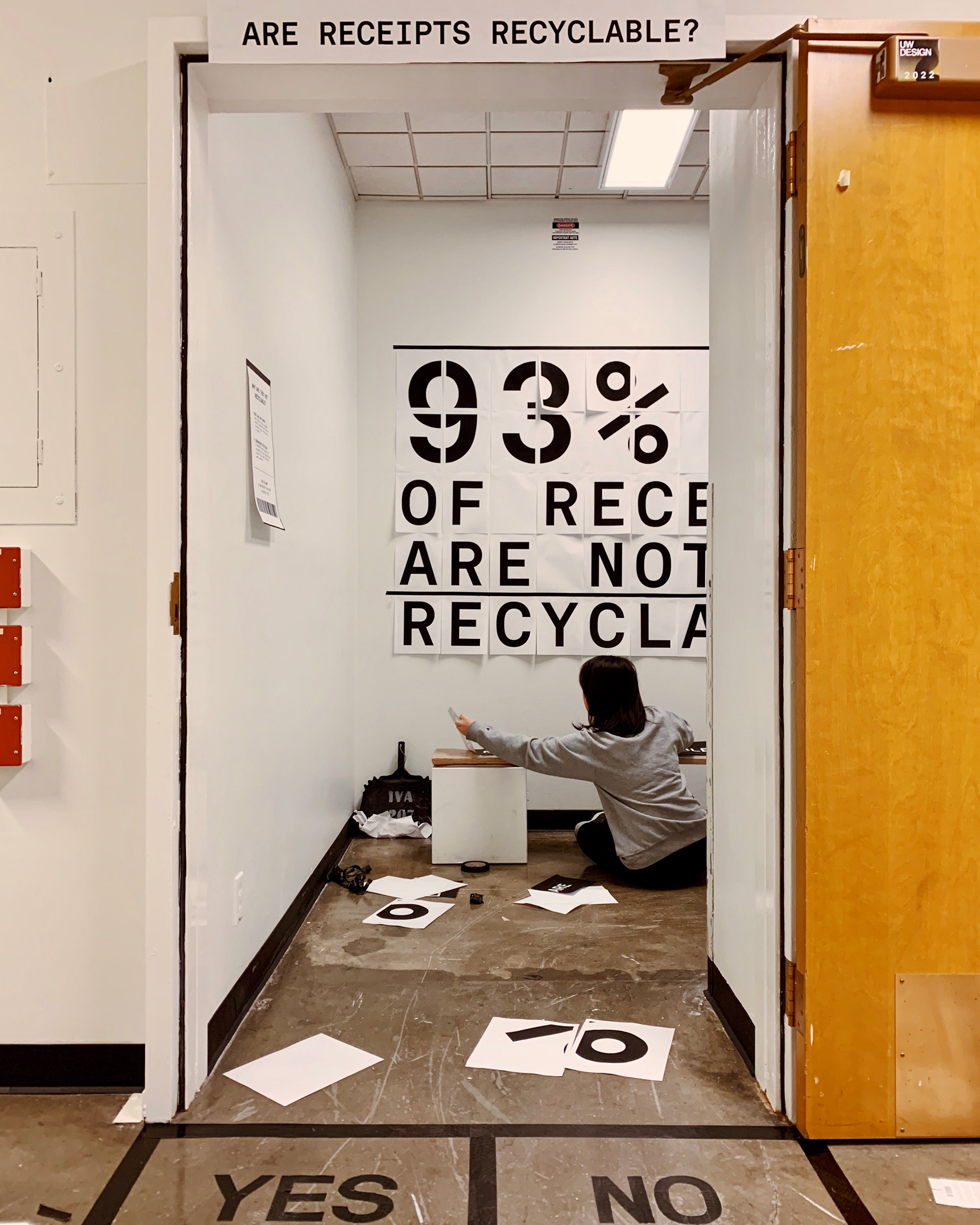
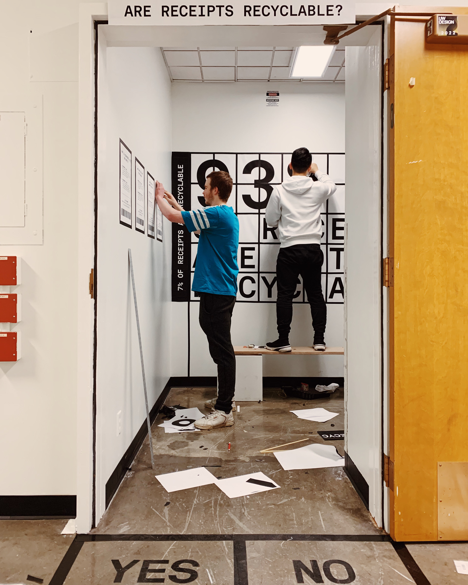
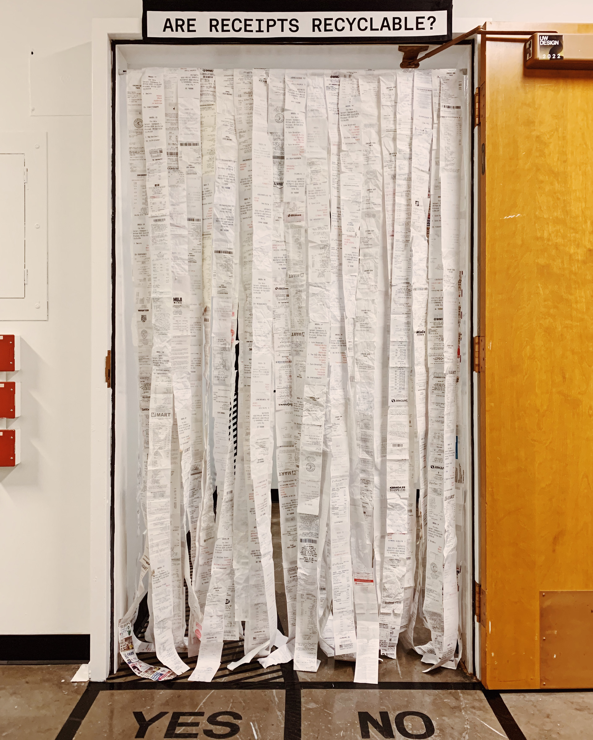
Our final exhibition
Documentation of our final exhibition space in photography and walkthrough.
View our full presentation deliverable here.
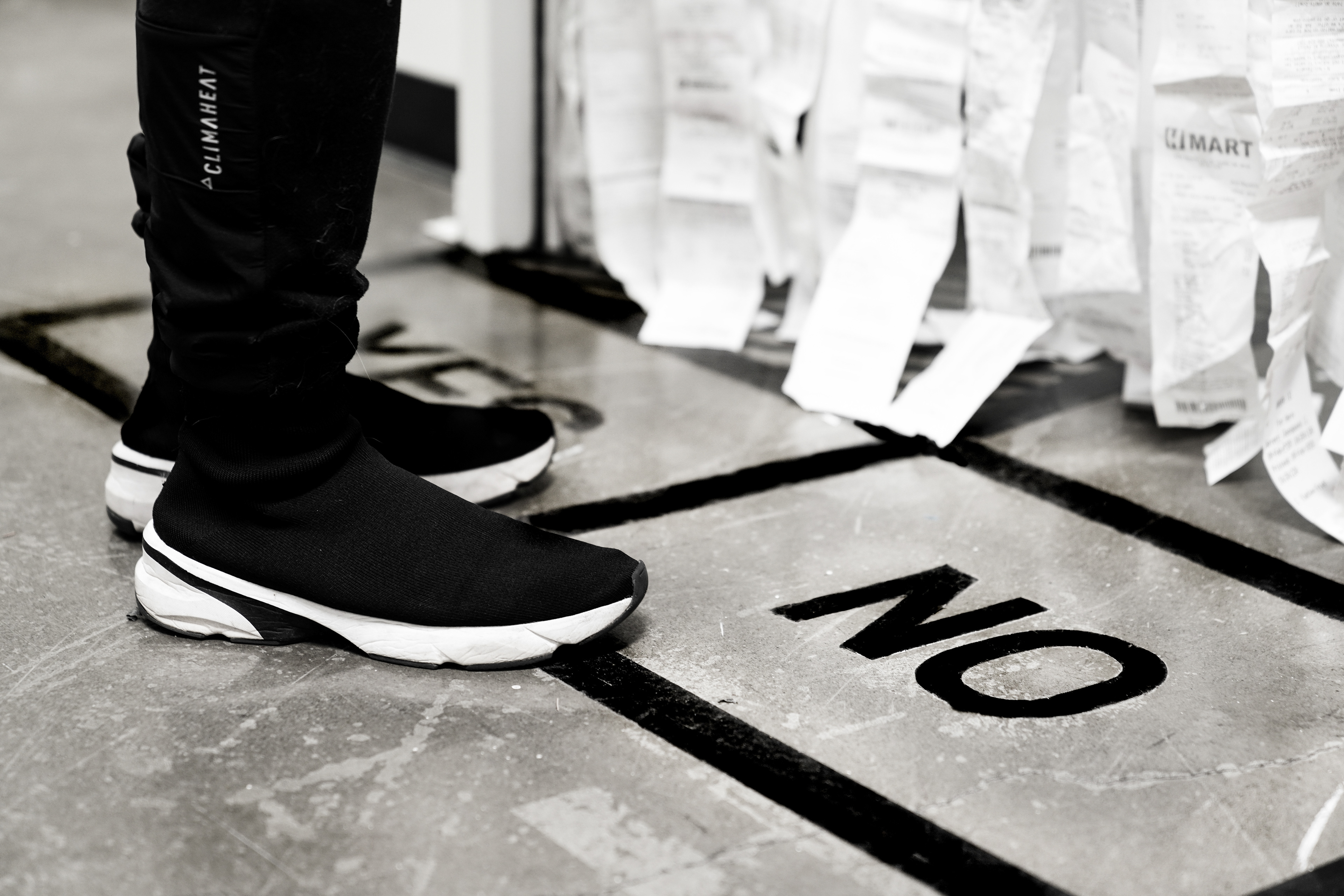
Walking in front of the installation
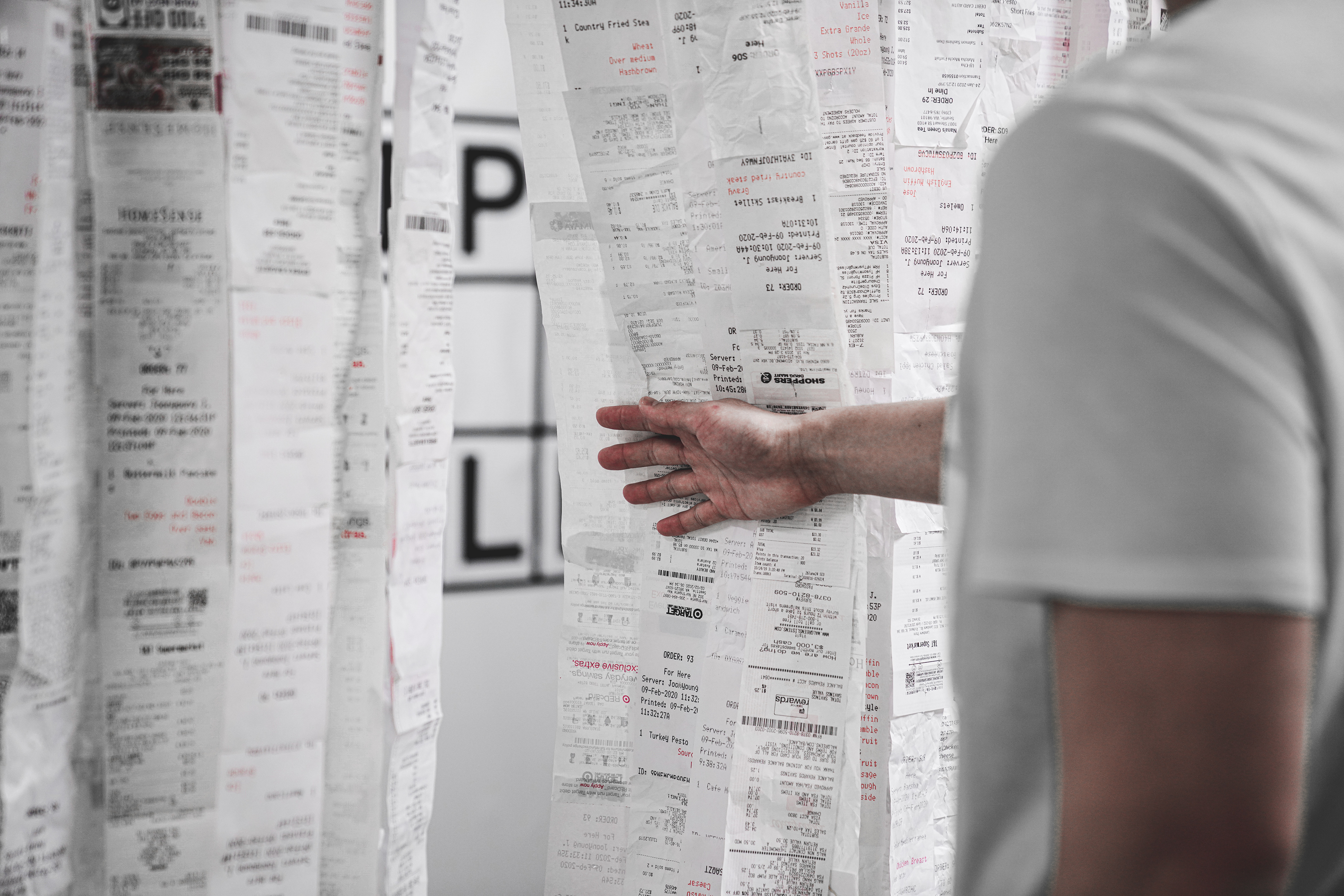
Draping the receipt curtain apart
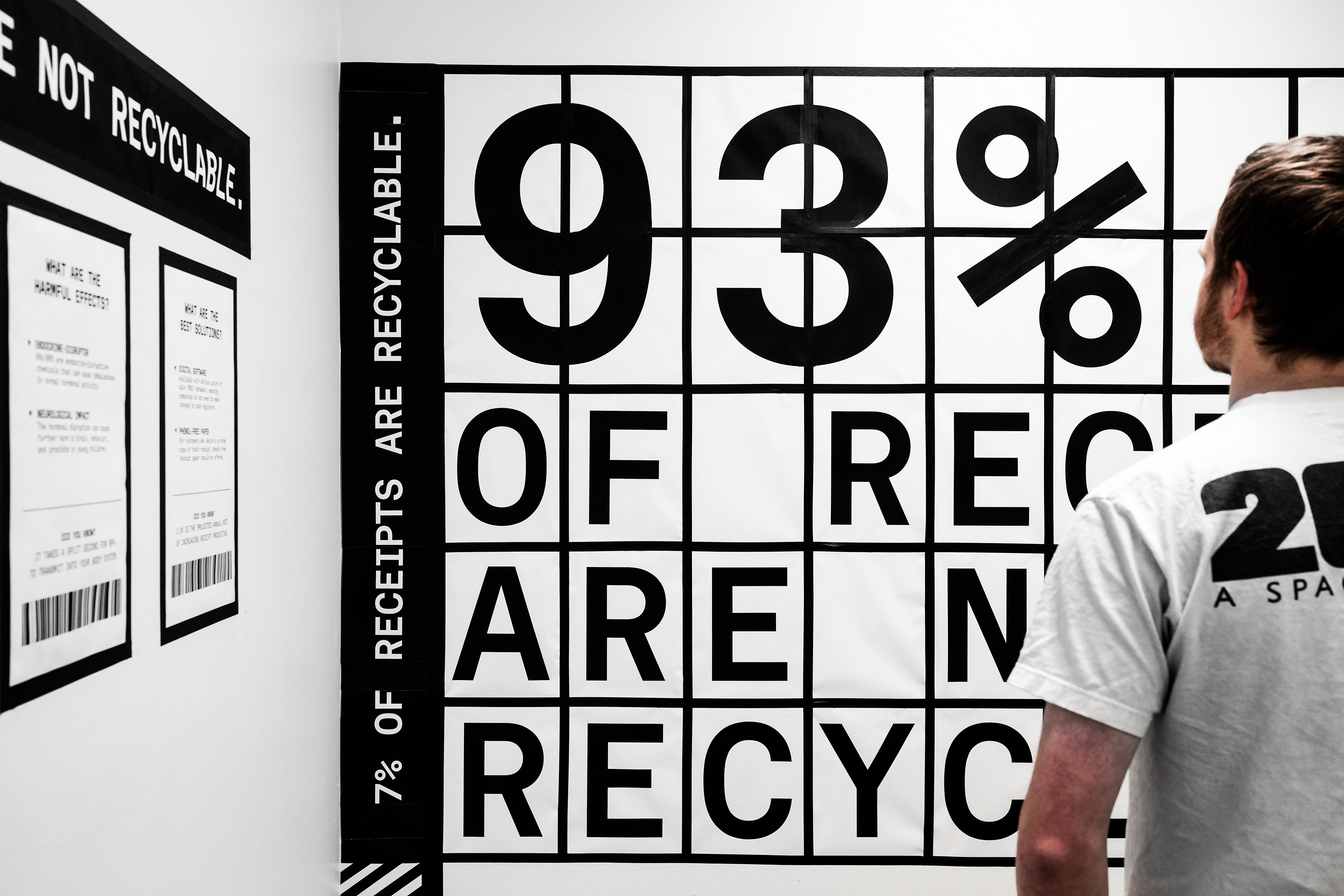
Front view of alarming statistic
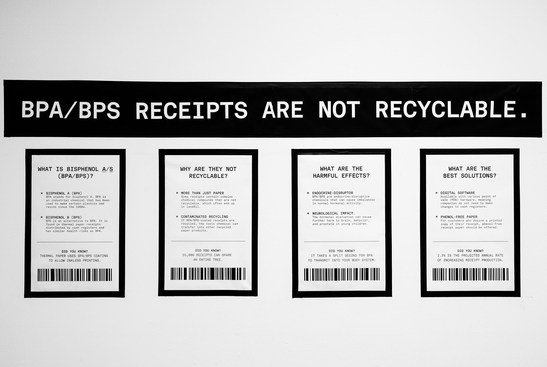
Narrative of the cause and effects of receipt sustainability
Proud of the team, our process, and final outcome! 🎉
CONTEXT
Sustainability, Research, Typographic Installation, Exhibition Design
DESIGN 467 Exhibition Design with Kristine Matthews
DESIGN 467 Exhibition Design with Kristine Matthews
DURATION
3 Weeks:
1 week research, 2 week iteration, 2-day execution
1 week research, 2 week iteration, 2-day execution
TEAM
Calvin Kordel
Receipt Research, Content Strategy, Concept, Prototyping, Receipt curtain/tiling installations
Pan Li
Research, Concept, Prototyping, Photo documentation, Receipt curtain/tiling installations
Receipt Research, Content Strategy, Concept, Prototyping, Receipt curtain/tiling installations
Pan Li
Research, Concept, Prototyping, Photo documentation, Receipt curtain/tiling installations
MY ROLE
Sketching & Illustration
Diagramming & Prototyping
Creative Direction
Content Strategy
Photo documentation
Receipt curtain/duct tape typography/diagonal stripe installations
Diagramming & Prototyping
Creative Direction
Content Strategy
Photo documentation
Receipt curtain/duct tape typography/diagonal stripe installations
