CHALLENGE
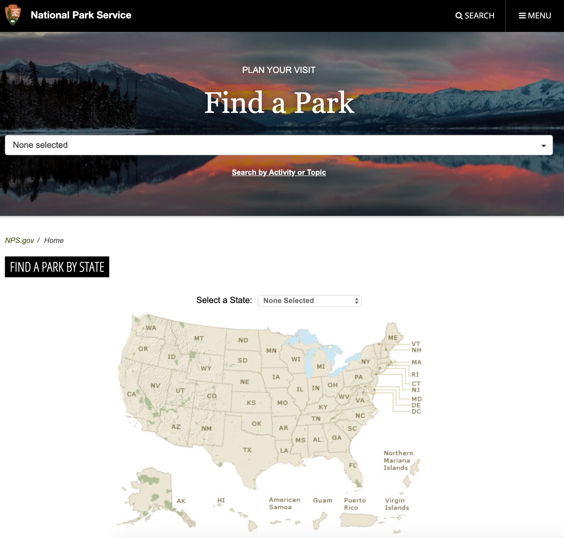
The current National Parks Services (NPS) website, NPS.gov, contains too many portals of dense information without a clear hierarchy for users to identify what are they searching for. In addition, it lacks the aspect of conveying the excitement and adventurous spirit of national parks.
OBJECTIVE
To redesign the National Park Service platform by highlighting essential content, adding incentives for users to explore, and creating a visual identity that would inspire adventures.
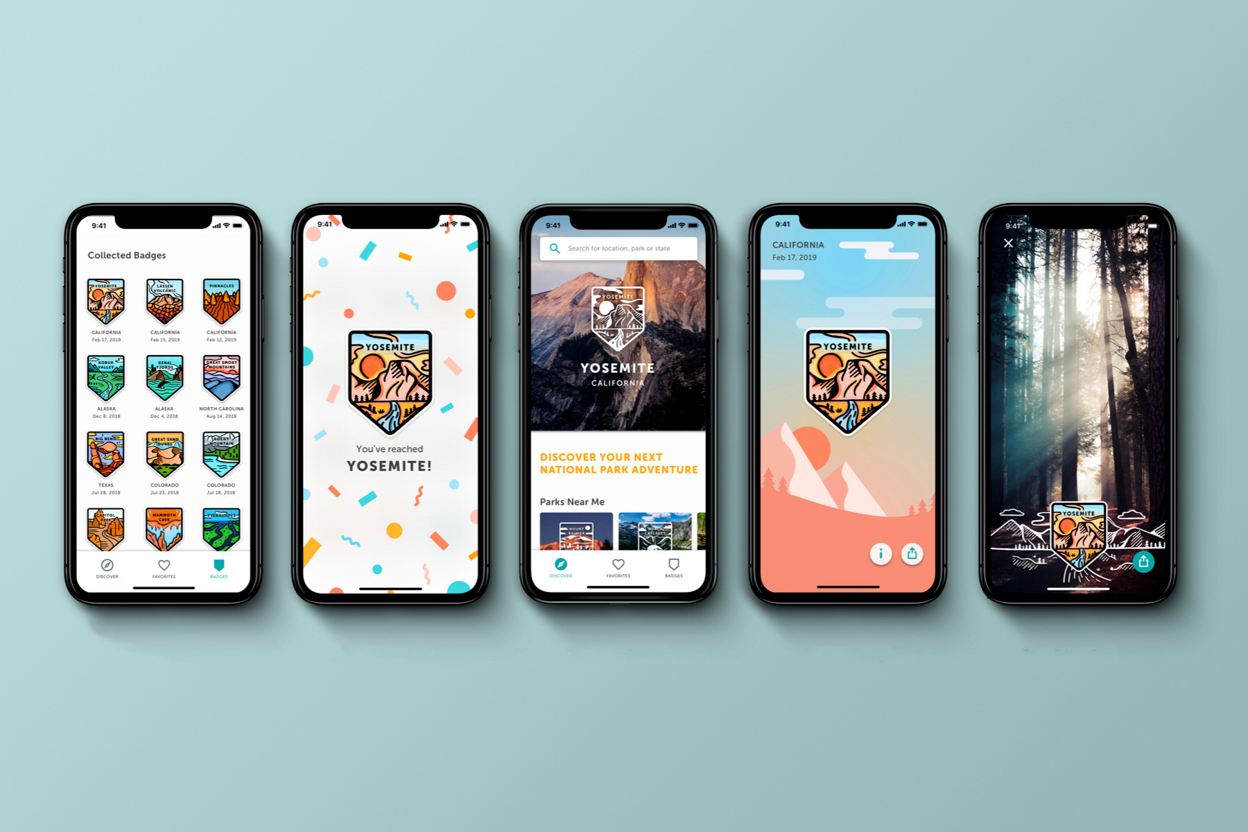
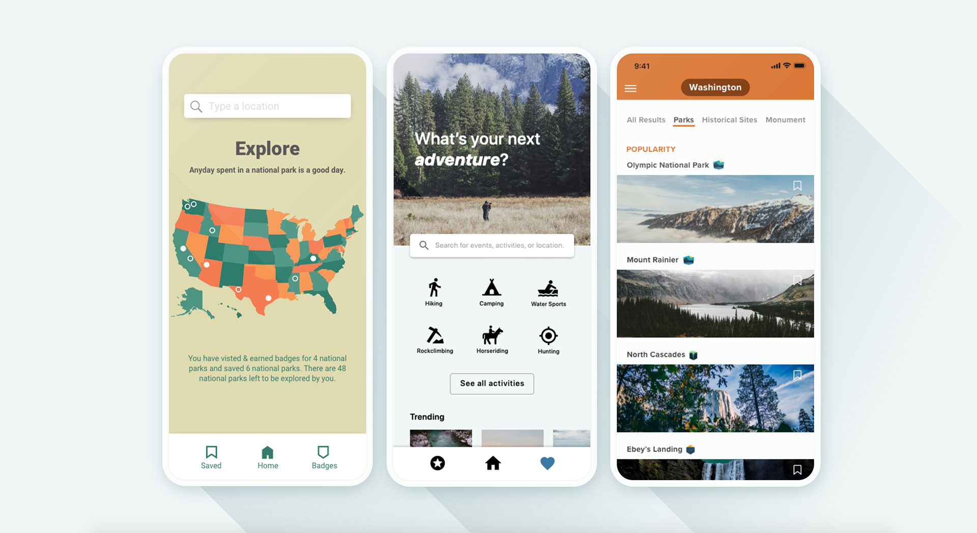
Browse and save parks of your interest
Discover national parks, ranging from featured to hidden gems, and save the parks that you love to your favorites.
Enter the park & collect a badge
Earn a badge when you enter a park and celebrate each milestone with a surprise.
Admire & share your badge
Select a specific badge to relive the park’s picturesque moment and share your favorite badges wherever you go.

Our target users are adventurous collectors, explorers, and nature lovers.
We want to make national park adventures more personal and enjoyable for avid nature lovers and explorers of all ages, or those who simply just want to collect!
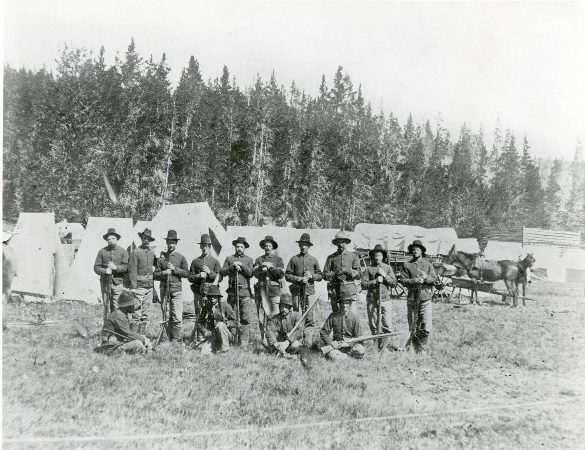
Badges have been a significant part of the history of National Parks.
The earliest ones were given in 1894 to “Yellowstone Park Scouts” to protect the park from illegal poaching, worn as part of their uniforms. Gift shops now have unique patches for sale to add to your collection.
We want to digitize this experience and provide an incentive for our users to explore and discover national parks, collecting souvenirs and milestones in their pockets where ever they go.
Gamifying the experience
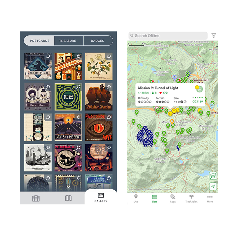
Drawing inspiration from apps that utilize gamification in exploration like Two Dots and Cachly, adding incentives is necessary to promote user interaction and motivation to collect and explore all national parks.
Two Dots guides players on a journey and awards postcards and badges as progress level indicators, whereas Cachly is a geocache app that utilizes methods of rewards in a scavenger hunt to build community.
The Process
How it all came together and what we’ve deliberated to make this experience both meaningful & enjoyable.
1: Three design directions
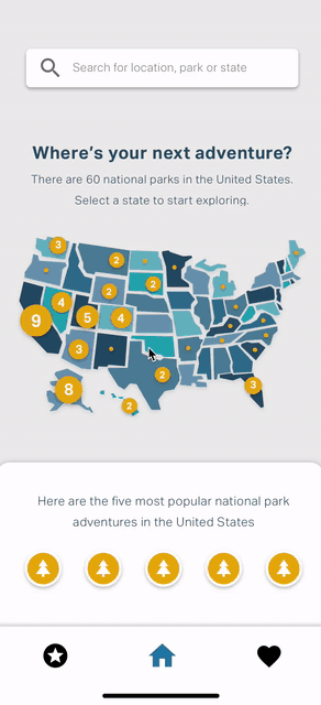
1. Map visualization of parks by state
2. Explore activities
3. Browse by selected location
insights moving forward
• Ticketing/browsing activities should not be central to our app
• Collecting badges should be featured as the app's main task flow
• Make it more vibrant, lively, and fun!
2: Combining map visualization & badges
We combined the map visualization concept and the badge collection with discovering parks as our primary task. However, the combination of the two concepts were competing against each other. In addition, the postcard style of the badges was not captivating enough to add incentive.
insights moving forward:
• Editorial layout would suit national parks search better
• Difficulty to showcase information hierarchy with a miniature map
• Badges are hidden against a photograph background — how might we make the badges central to the interface?
3: User Research Testing
After refining our prototype, we conducted user research testing to gain insights into the friction points of the 3 task flows
1. Browse & save national parks of interest
2. Check the notification & see earned badge
3. Collect badges & share them on other platforms
"Bucket List" icon
Editorial feed
Content within park of interest
User Testing Insights
1. To “Save” or to “Bucket”?
The idea of adding parks to a bucket list seemed like a fun idea for our brand. However, user testing indicated a struggle to locate bookmarking option since the “bucket” icon is not too universal as opposed to a “heart” icon.
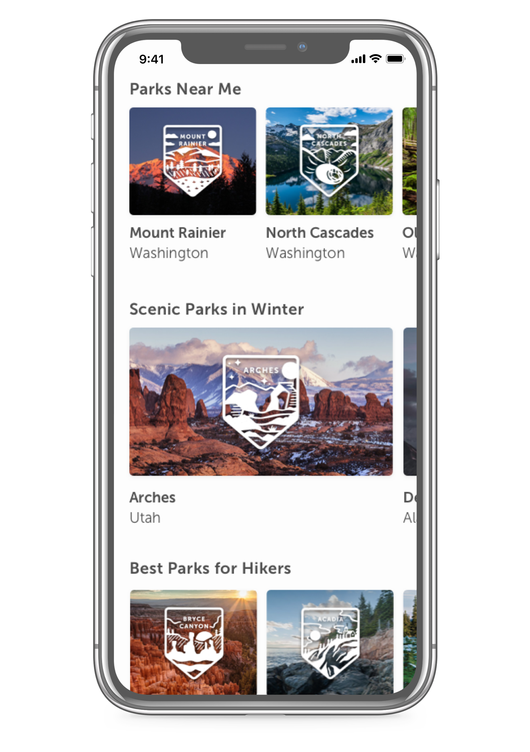
2. Editorial content is more digestible than a newsfeed
Our users indicated that they would like to see more curated editorial content. We discovered that some of our editorial titles should be more clear and more direct to avoid jargon.
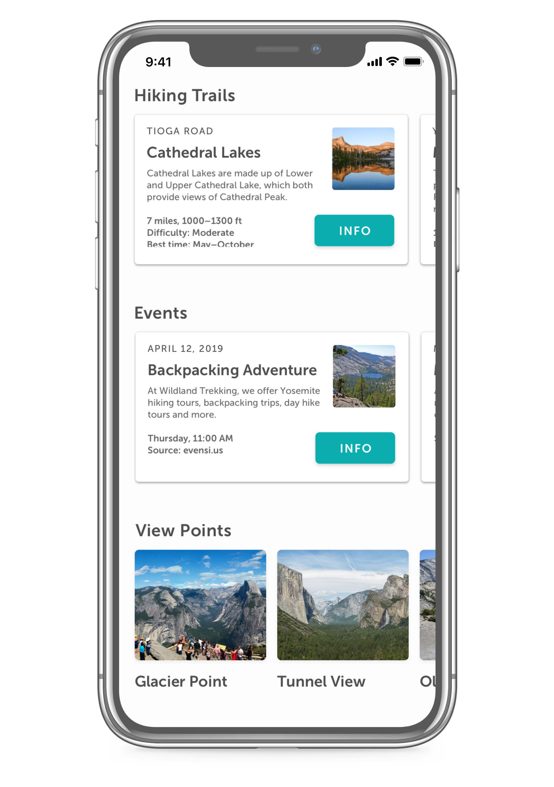
3. Park history was ranked as the least important information
A diverse range of information about the park was necessary to cater to different interests. Surfacing information like scenic trails, relevant events, and recommendations are more personally tailored than historical information.
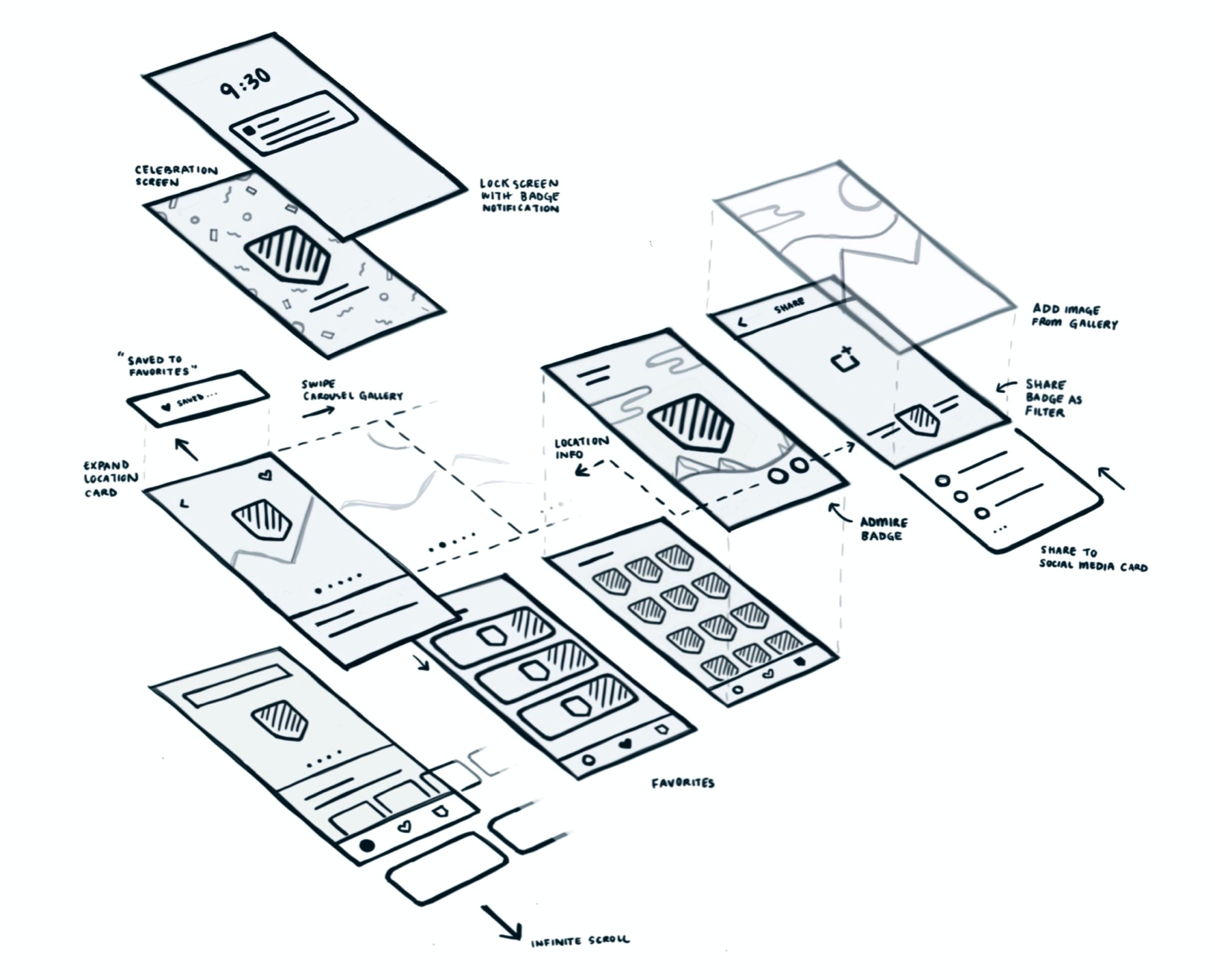
4: Finalizing information architecture
Overview of app mental model & task flow
The mental model of the app follows a three-tier structure with three ports including discover, saved, and badge collection. To simplify the information architecture, the national park overview acts as an overlay on top of the base home screen.
Mental Model of Information Architecture with three-tier structure
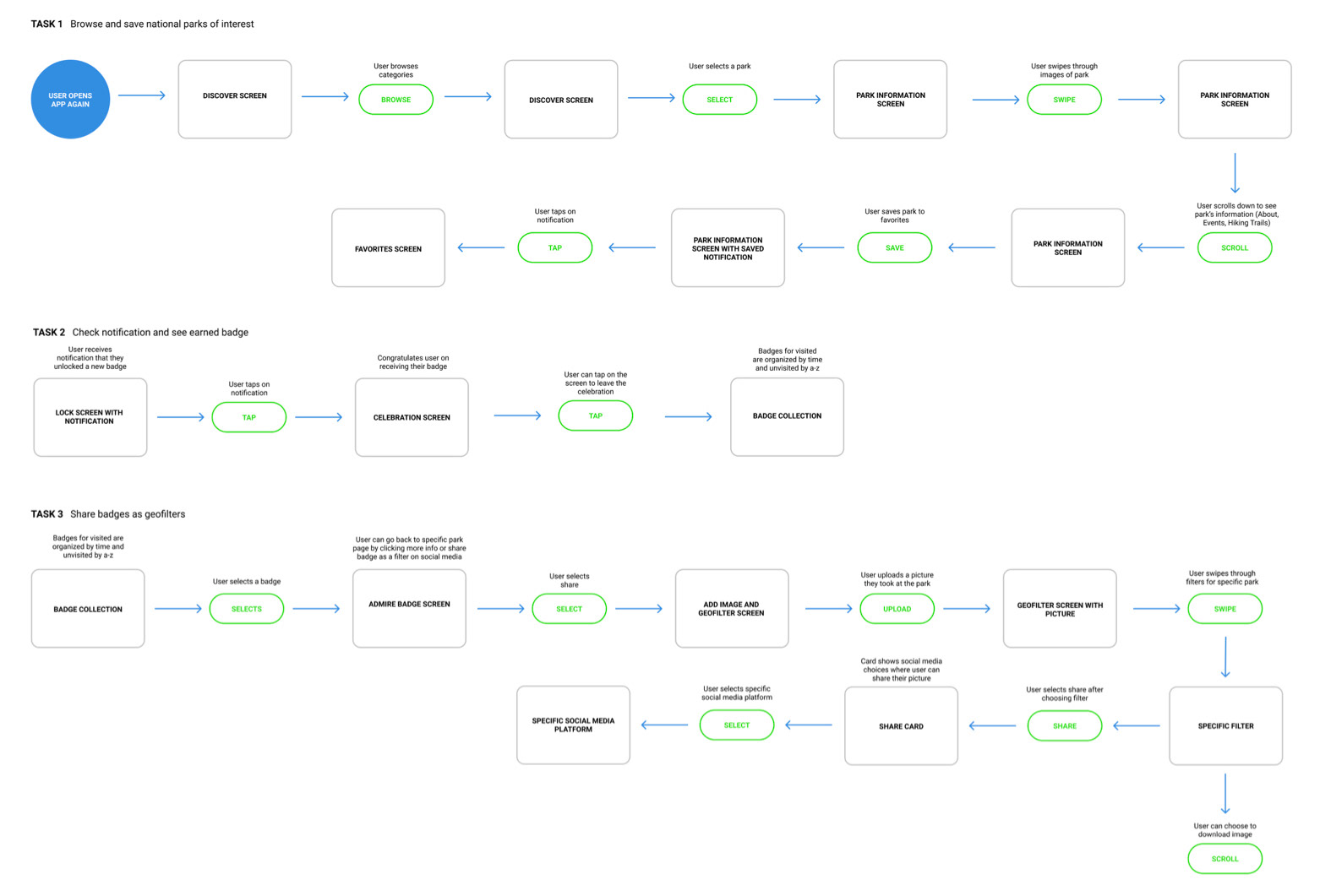
Task Flow of Parca outlining an overview of user call-to-action (CTA) interactions and key views of interface.
5: Microinteractions
With each task flow, showing the microinteractions helped enliven the interface giving personality and dimension.
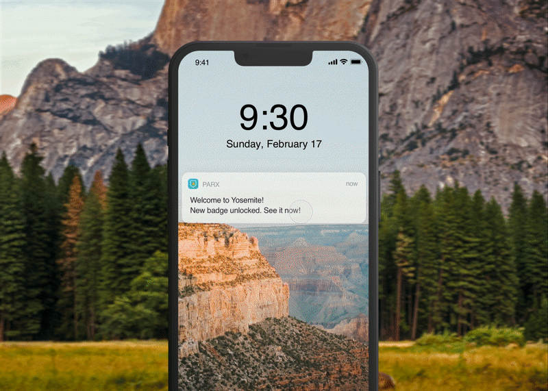
"Badge celebration" Animation
A celebratory moment
Grabbing inspiration from apps with celebratory moments, we wanted to perfect the motion and momentum of the confetti as the user enters the park and collects the badge.
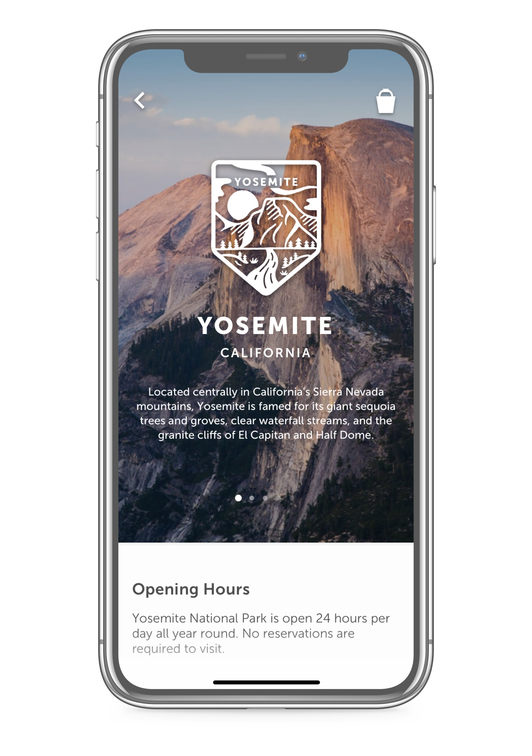
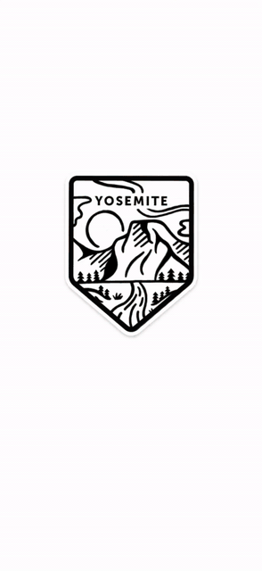
Admiring your badge
The visual branding of the "admire badge" illustration is created to add a sentiment to reminiscing the moment of entering the national park.
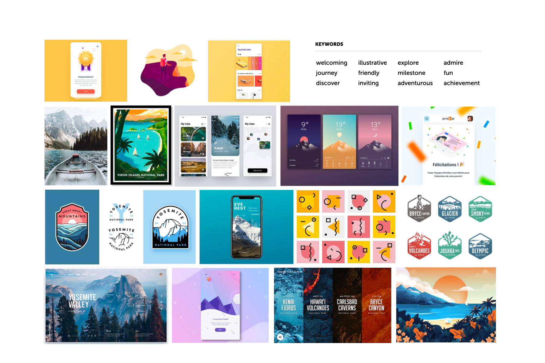
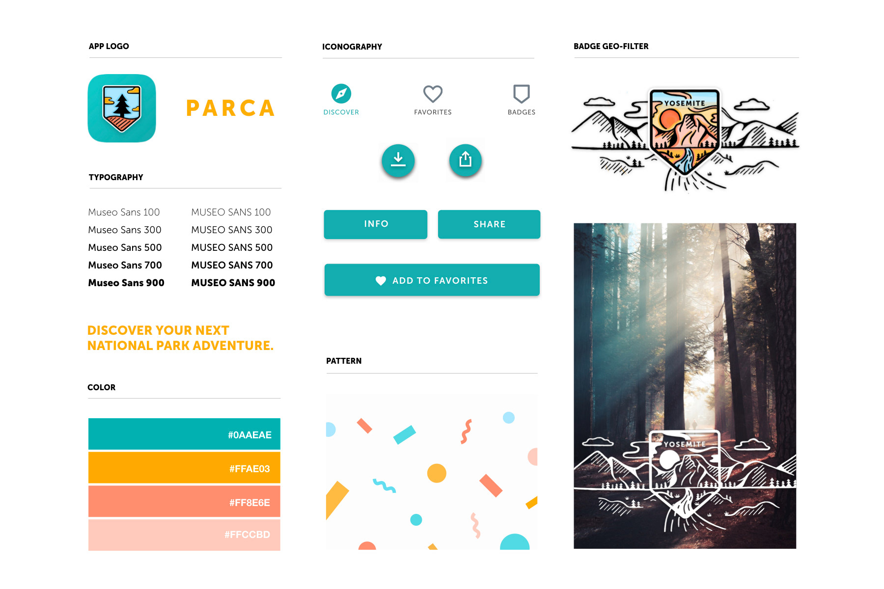
6: Branding the whole experience
With the motifs of "celebration, collection, and milestones” in our interface branding, the visual style of our interface encompasses an uplifting and inviting brand, suitable for anyone who enjoys endearing photographs & illustrated landscapes.
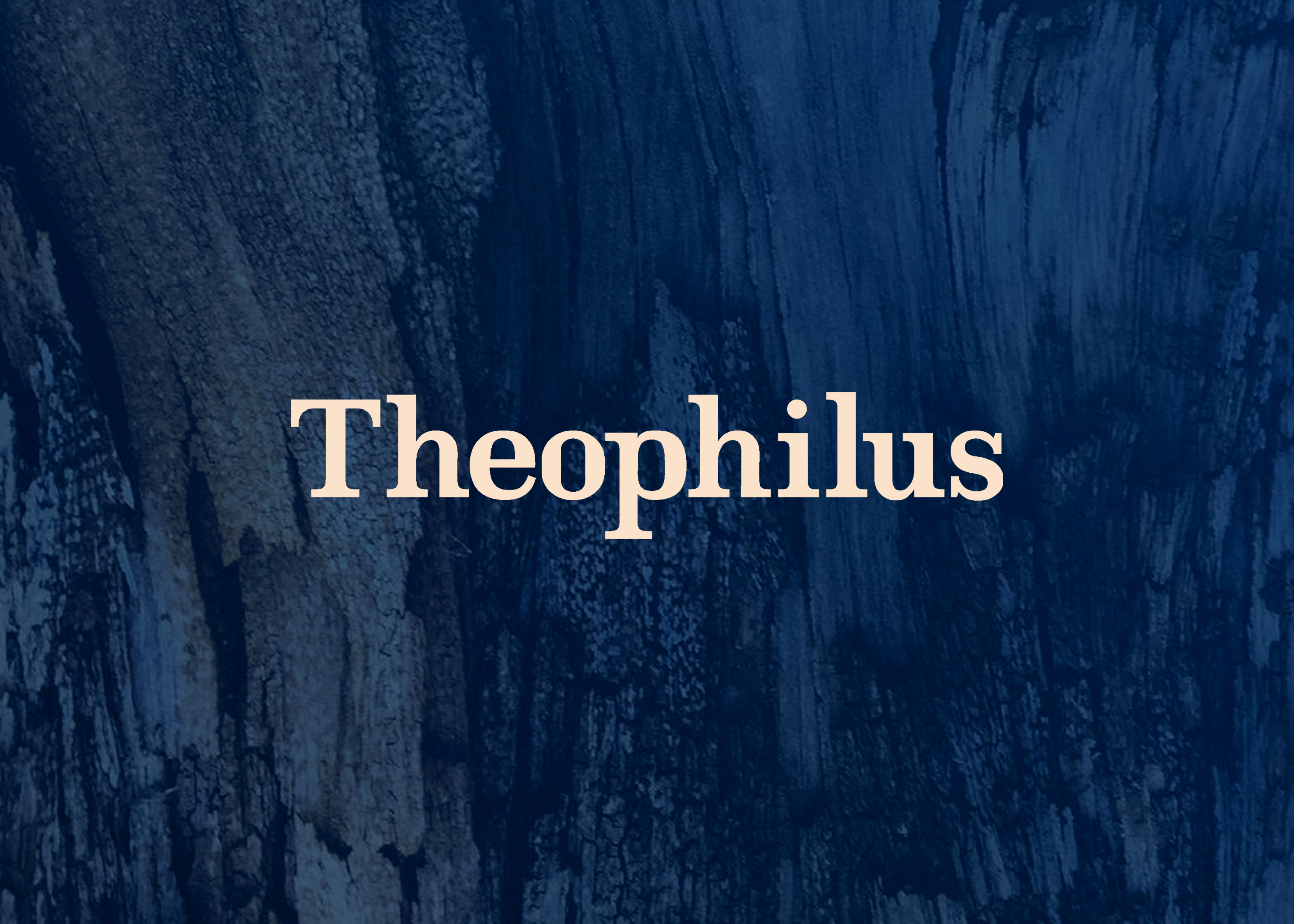
Our logo
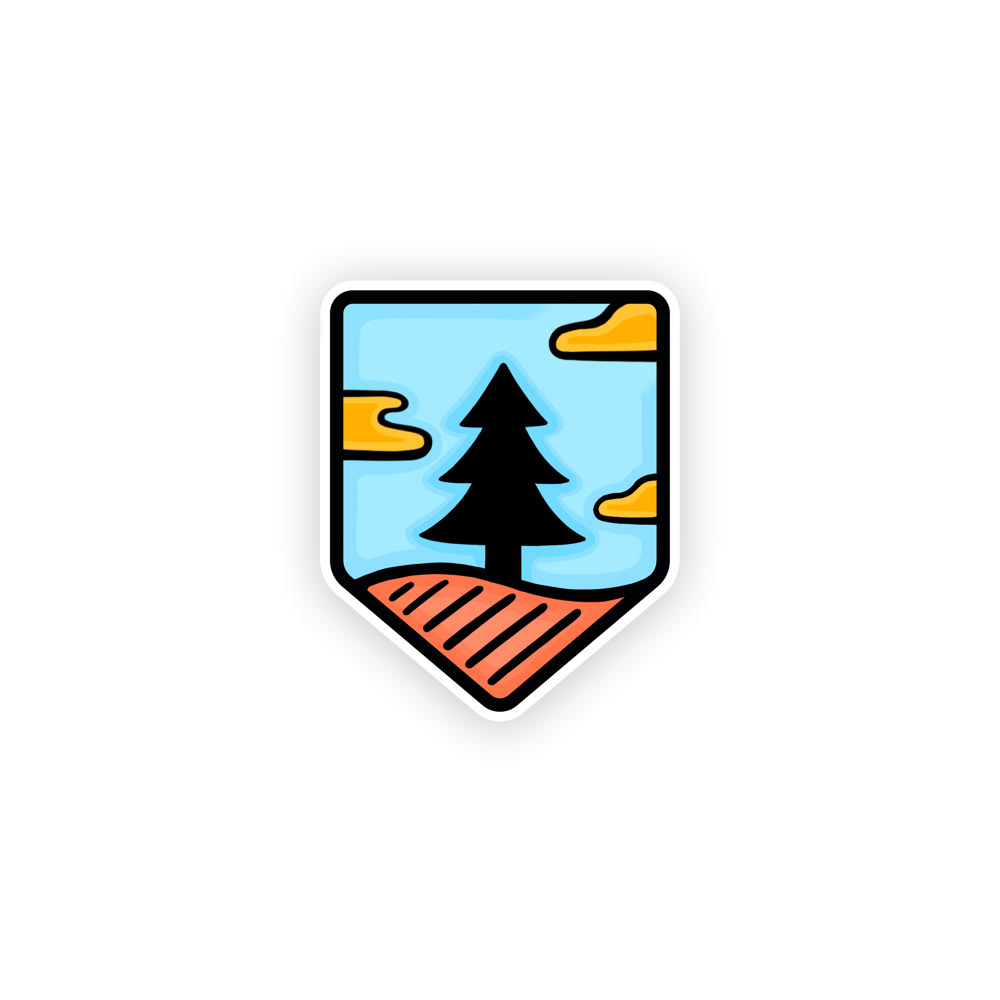
Our logo is created with the same organic hand-drawn stroke that resembles the badge illustration style, following the badge shape and a simplified illustration of the national park imagery.
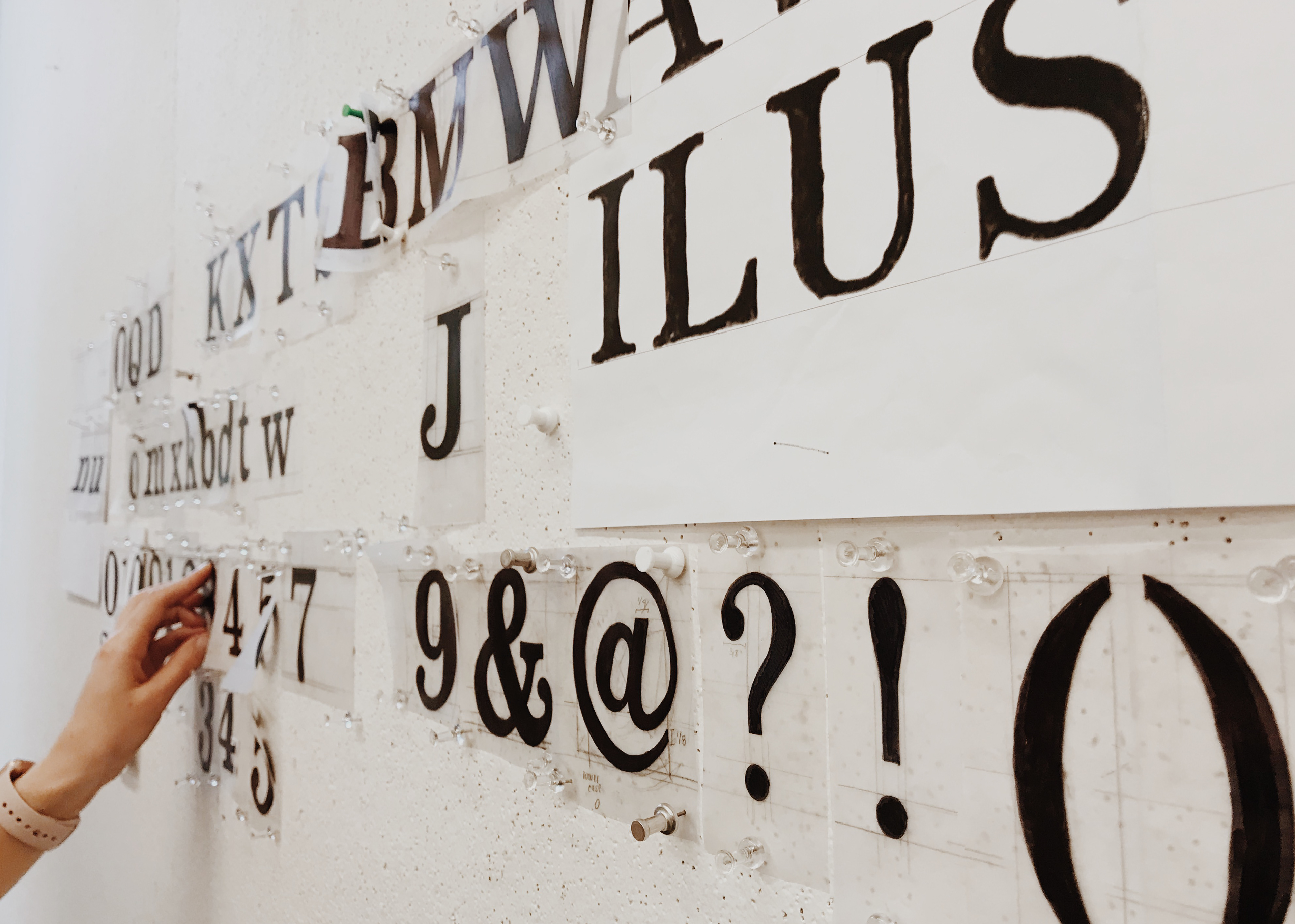
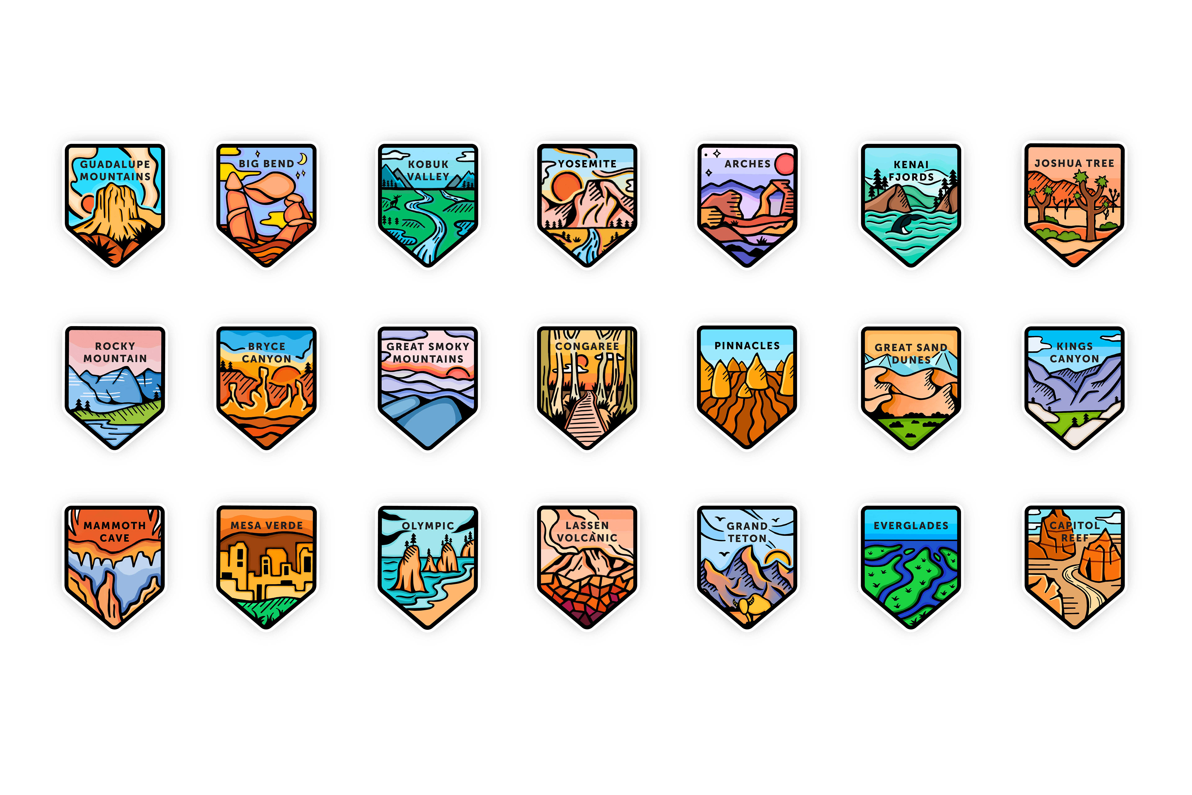
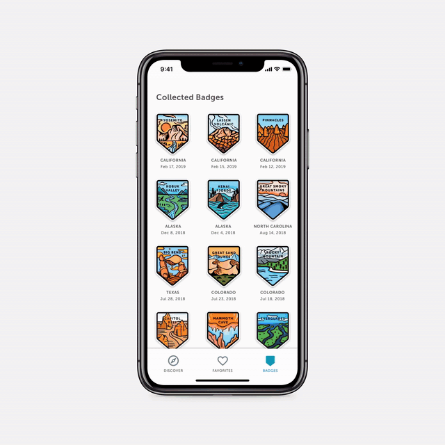
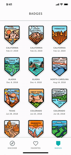
Illustrating 60 badges!
We explored various styles of illustrations and found that a hand-crafted stroke encompasses authenticity and captures the natural organic aesthetic of national parks.
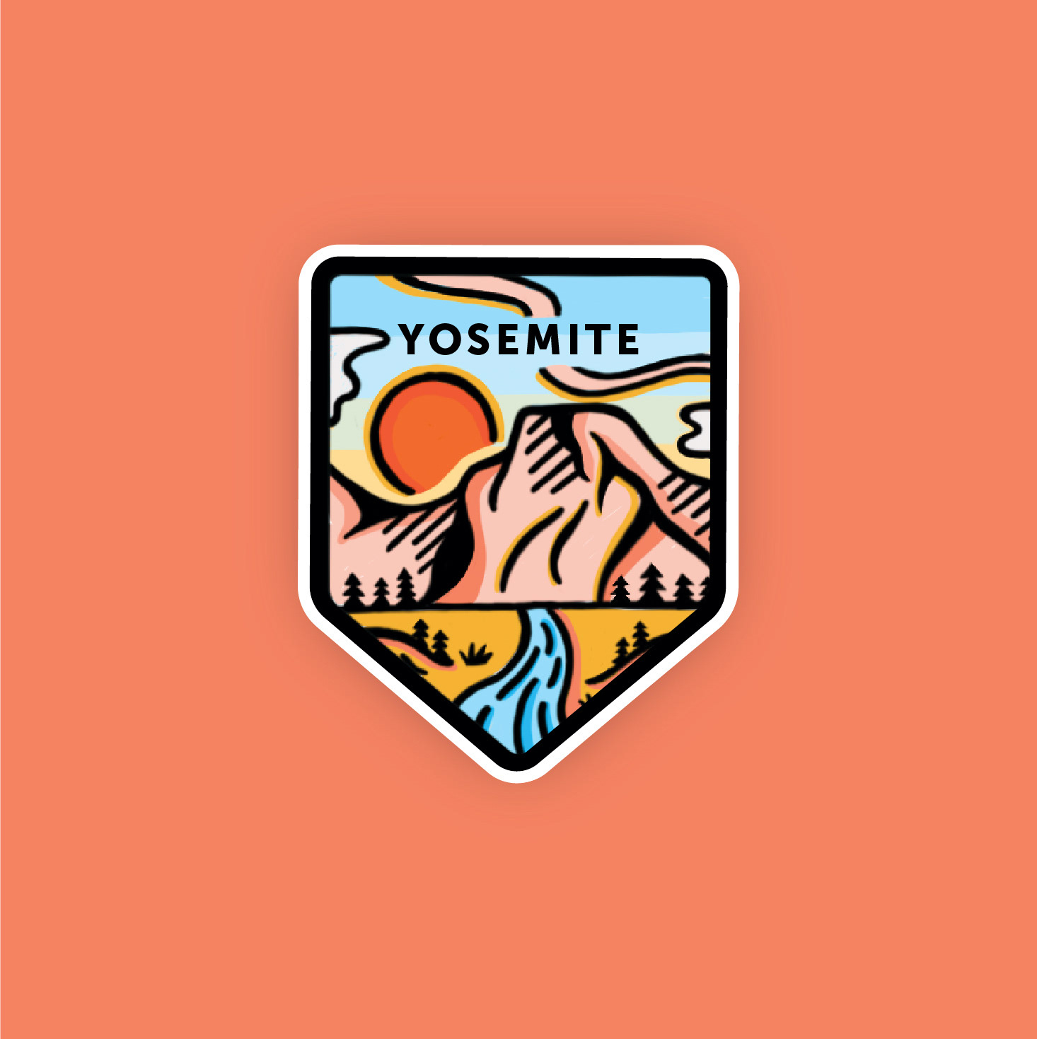
Curating our badge style
I had the opportunity to establish the illustration style for Yosemite, and from there, my team and I iterated and refined the rest of the national park badges within an established badge frame and type lockup.
After many rounds of iterating and refining, we managed to illustrate a total of 60 unique and custom national park badges.
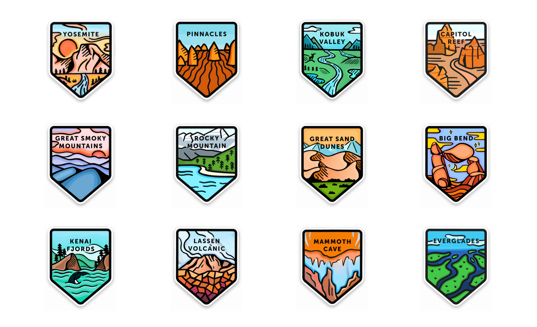
Illustrating the "discovered" badges. I was in charge of illustrating Yosemite, Kobuk Valley. Lassen Volcanic, and Mammoth Cave.
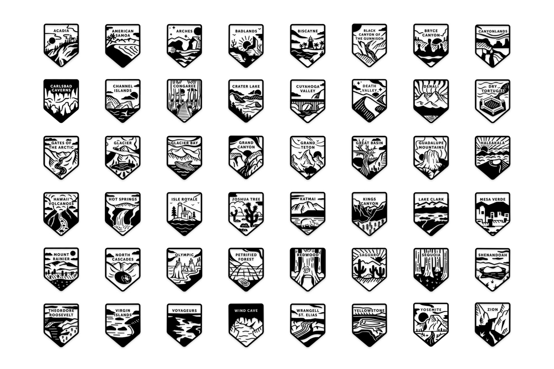
Illustrating the rest of undiscovered National Park badges.
Our visual elements
We used a bright, friendly color scheme to portray an optimistic look to our brand. We kept our iconography and typography minimal to avoid overshadowing the badge illustrations. Graphic shapes are used for the celebratory moments and photographs to add a sense of relatability to the experience.
Final Parca video
The objective of this video is to story-tell the experience of national park discovery and adventures in the perspective of our targeted audience.
TAKEAWAYS
Establishing a cohesive visual system for our app
Working with a strongly branded interface concept, it was important to find a middle-ground to create and communicate our visual style, specifically for the badge illustrations and how the "star" of our app transfers to other parts of the system.
Creating a universal language for our users
Content strategy is crucial when researching the national park services, i.e. the editorial newsfeed content we should display while showing the personality of our brand.
User research as a lens for practicality
In creating product design, it is easy to get into the pixels and details of what makes sense visually and unknowingly disregard user considerations. Hosting a user research session with our participants helped clarify the language we wanted to use to make it easily understandable with more seamless interactions.
NEXT STEPS
Gamifying the experience by adding another layer of interaction
Our current app concept focuses more on the task of entering, receiving, and sharing national park badges. To better gauge the progress of collecting all 60 parks, a gamified progression of levels could measure the user's milestones and add incentive to complete each "level".
Prioritizing digital accessibility
One aspect that we could improve for our interface concept is making sure our visual elements are accessible. Our interface includes a lot of vibrant light-value colors that might challenge color usage accessibility needs. Finding a way to maintain the brand while making it universally accessible would be a great next step.
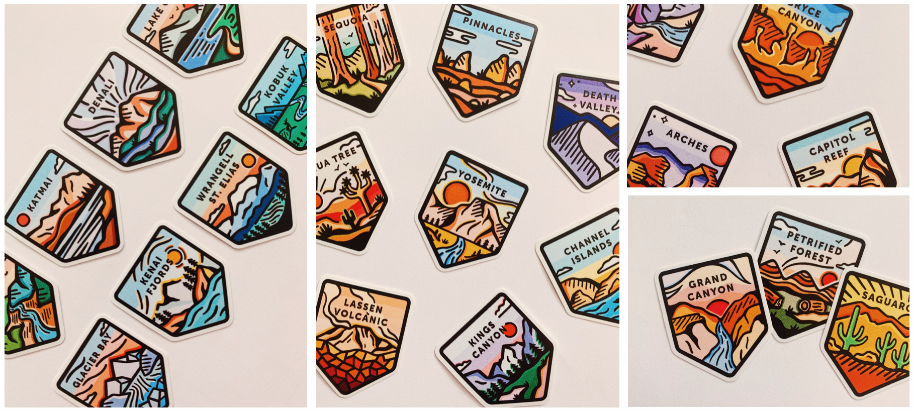
Turning badges into stickers 👀
Check out my Etsy for some colored sticker designs for all 63 USA parks!
PROJECT DETAILS
CONTEXT
Collaborative project
Product design, Illustration, User Research, Animation, Storyboarding, Branding
Product design, Illustration, User Research, Animation, Storyboarding, Branding
DURATION
5 weeks
INSTRUCTOR
TEAM
Bridgette Chen
(Logo Identity, User Testing, "Celebration" Animation, 20 Badge Illustrations, Concept 1, Moodboard)
Patricia Lee
(Content Organizer, User Testing, "Admire Badge" Animation, 20 Badge Illustrations, Concept 3, Moodboard)
(Logo Identity, User Testing, "Celebration" Animation, 20 Badge Illustrations, Concept 1, Moodboard)
Patricia Lee
(Content Organizer, User Testing, "Admire Badge" Animation, 20 Badge Illustrations, Concept 3, Moodboard)
MY ROLE
Wire-frames/Mock-ups
User Testing
Discover Parks & Share Badge Animation
Badge Illustrations (Yosemite, 20 badges, extra Yosemite geo-filter)
Storyboarding & Video-editing
Creative Direction (Admire badge illustration, Logo Direction, Video)
User Testing
Discover Parks & Share Badge Animation
Badge Illustrations (Yosemite, 20 badges, extra Yosemite geo-filter)
Storyboarding & Video-editing
Creative Direction (Admire badge illustration, Logo Direction, Video)
TOOLS
Sketch, Principle, Figma, Procreate, After Effects, Premiere Pro